Watercolor Painting App Guide: Types and How to Choose
What makes a watercolor painting app worth paying for? Ask a dozen reviews and you'll get a gallery of pretty output. That answers a different question. A convincing image proves the app has a good filter. It doesn't prove the app behaves like paint, and it says nothing about whether your hand can stand to use it for an hour.
Two tests separate the apps that teach watercolor behaviour from the ones that only imitate the look of it. First, does the paint respond to causes you control, such as water, pigment load, timing and paper texture? Second, can you paint comfortably, with a resting palm, a stylus and hands that don't always land where you aim?
This guide sorts the category into three kinds of tool, explains how digital paint is simulated, and then gives you a checklist to run inside a free trial before any money changes hands.
Three Kinds of Watercolor Painting App and What Each Gives You
The key choice is what you want to practise: transforming a photograph, painting by hand, or learning actions that carry over to physical watercolor. Some apps combine these approaches, but each has a different strength.
| App type | What it does | Example | Best for |
|---|---|---|---|
| Photo-to-watercolor converter | Turns a photo into a watercolor-style image | Waterlogue (iOS) | Quick painted-looking images from photos |
| Manual painting app | Gives you brushes, water and pigment to paint by hand | Tayasui watercolor painting app | Original artwork and daily painting practice |
| Learning-focused app | Models real watercolor actions such as pigment loading, water control and layering | A watercolor painting app designed around real watercolor actions | Beginners preparing to paint with physical watercolor |
| Hybrid app | Combines photo conversion with hand painting | A converter such as Waterlogue paired with a manual app such as Tayasui | Readers who want both painted photos and original work |
Photo-to-watercolor converters turn a photograph into an image with a painted appearance. They use neural style transfer, a technique that separates an image's content from an artwork's style and combines them, as this overview of photo-to-watercolor apps explains. The result can suggest watercolor paper and pigment, but you choose the photograph, not where paint flows across the page.
Manual painting apps give you a digital brush to guide across a canvas. Tayasui is one example. Choose this kind of app when the goal is making original work or building a regular painting habit. A cartoon profile picture maker can also transform a photo into a stylised image, but that is a different task from painting with a brush.
Learning-focused apps organise painting around physical watercolor actions, such as loading pigment, controlling water, layering, lifting paint and responding to paper texture. A comparative study of watercolor painting interfaces found that an interface built around real watercolor actions led to better paintings and higher user satisfaction than a conventional digital watercolor interface, though users did not paint faster. The value is in learning the sequence of actions, not speeding through it.
If you want both photo conversions and original paintings, you may need a converter and a manual app rather than one tool for both jobs. On an iPad, consider pairing a stylus with drawing apps as you choose your setup.
Rule of thumb: Choose by the work you want to do: transform a photo, paint an original, or practise skills for physical watercolor.
How a Watercolor App Simulates Paint on Screen
Watch one stroke dry and you've seen the whole model. The brush touches the paper and leaves a bead of water carrying pigment. For a moment the wash is liquid and moving, and pigment drifts outward toward the edges. Then the water evaporates, the pigment has nowhere left to go, and it settles into the tooth of the paper, darker at the rim and grainy where the surface dips.
A watercolor painting app worth its price reproduces that sequence rather than stamping a texture that resembles it. The technical basis is a pairing of two models: shallow-water fluid simulation, which transports water and pigment across the paper, and Kubelka–Munk compositing, which calculates how overlapping layers absorb and scatter light, according to the computer-generated watercolor research from the University of Washington.
Each stroke becomes a wet layer with real properties. Water depth, pigment concentration, flow velocity, absorption coefficients and scattering coefficients all describe that layer at a given moment. While the layer is wet, simulated water flow pushes pigment around. As water evaporates, concentration rises and pigment settles where the paper structure traps it.
Then come the two settings that make results feel pigment-specific rather than generic. Granulation constants vary by pigment and decide how readily particles gather in the valleys of the paper. A paper height map decides where that accumulation becomes visible on screen.
Why an opacity slider can't fake a glaze
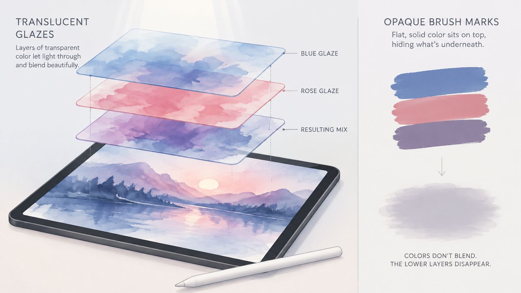
Simple alpha blending, the transparency model most drawing apps use, is the reason some watercolor effects look flat. It can't reproduce the value shifts, hue contamination or transparency changes that appear when multiple washes overlap. Everything mixes toward grey.
Think of a stack of tinted glass panes. Light passes through each one and the colours combine, so three panes read differently from one thick pane of the same colour. A stack of opaque paint dabs does the opposite: each one hides what's beneath it. Real watercolor is the glass stack. Glazing only works when the app composites layers optically instead of pasting colour on top.
Here's the same idea in motion, which makes the wet phase easier to see than any diagram.
On screen, look for four signals that the simulation is real. Wet-on-wet blooms should spread where you added water. Transparent glazing should darken a passage without hiding the layer beneath. Edge darkening should appear as a wash dries. And granulation should differ between a sedimentary pigment and a staining one. If all four behave the same regardless of what you do, you're looking at a filter, not a simulation.
Brushes, Stylus Pressure and Tilt That Change the Paint
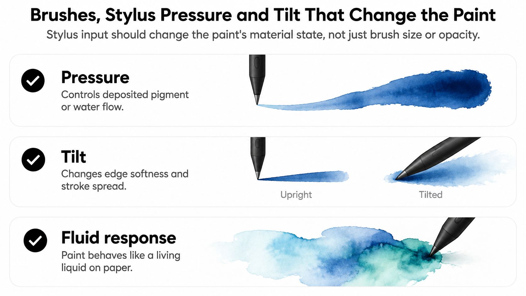
Stylus input should change the paint's material state, not just the brush size or the opacity value. That distinction is the whole test. Pressure that only makes a mark wider is a drawing tool with a watercolor skin. Pressure that changes how much pigment lands, or how wet the mix is, is a painting tool.
The Expresii watercolor system, described in the ACM paper on its fluid-based interaction model, uses computational fluid dynamics and incorporates tablet tilt plus stylus pressure to vary colour loading and direct paint flow. That gives a useful mental model for judging any app. Pressure controls deposited pigment mass or the water-to-pigment ratio. Tilt changes the gravitational component of the flow, so it alters the direction and speed of a wash, and in practice the softness and spread of the edge.
Because the process is dynamic, the app has to sample pointer position, pressure, tilt and timestamp continuously and feed those values into the solver while you paint. Applying them afterwards as a static stroke effect looks convincing in a screenshot and wrong under your hand.
If you're shopping for hardware before you shop for software, browse stylus pens for tablets with pressure and tilt support listed in the specs, because no app can report inputs the pen doesn't send.
Practical rule: modest pressure smoothing, low latency. Too much filtering and the paint feels detached from your hand. Too little and the pigment pulses unpredictably.
Five tests you can run in the first five minutes
- Pressure changes pigment load: press light, then heavy, on the same brush. The colour should get denser or wetter, not merely wider.
- Tilt moves a wash: tilt the stylus mid-stroke. The flow direction or edge softness should shift with it.
- The preview matches the landing point: a visible 3D brush tip aligned to the stylus lets you predict where paint will develop. Check it doesn't drift.
- The preview refines: a lower-resolution fluid preview during the stroke should settle into a cleaner result once you lift the pen.
- Opacity alone doesn't count: if the only control that changes anything is an opacity slider, the app is closer to a texture-stamped drawing tool.
None of this is exotic. It's the difference between painting and placing marks.
Accessibility Checks Most Reviews Skip Entirely
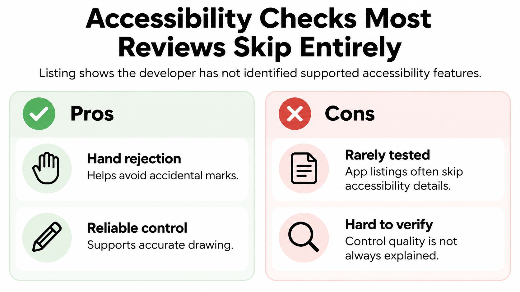
Assume nothing from a store page. The Tayasui Watercolor Painting App Store listing states plainly that the developer has not identified supported accessibility features. That silence is the normal case across the category: rich descriptions of brushes and effects, almost no practical evidence about whether you can paint comfortably for an extended session.
Why does that matter? Because a painting app is a hand-eye instrument, and accessibility problems in one behave like a pebble in a shoe. A gesture you cannot disable or a palm touch that fires an action mid-stroke is a small thing in a demo and a constant interruption in real work. For artists with tremor, limited dexterity, an unusual grip, or a hand that touches the glass the way hands do, those interruptions decide whether the app is usable at all. A convincing brush engine means nothing if your own hand keeps cancelling it.
A more immersive interface does not settle the question either. Whether the app runs on a flat tablet or in a flashier environment, it still depends on the same gestures, the same palm rejection and the same sustained hand positions. Judge it by how it behaves under your hand, not by how it looks in a trailer.
The tests that matter on your own device
| Test | Passing result |
|---|---|
| Gesture toggles | Each gesture can be turned off independently |
| Palm rejection | Resting palm causes no accidental strokes or undo actions with each stylus tested |
| Reachable controls | Core tools work without precise finger movement |
| Assistive support | Screen reader, reduced motion, colour-vision settings and external keyboard are available |
| Session log | Accidental undo count stays at zero or near zero over a full session |
Run these deliberately rather than hoping to notice a problem later. Rest your hand on the screen mid-stroke and count what happens. Try the two-finger and three-finger gestures one at a time and see whether each can be disabled without killing the others. Switch styluses if you own more than one, because palm rejection is a partnership between pen, tablet and app.
Count failures, not stars. "Four accidental undos in twenty minutes of painting" tells you more than any rating average.
Keep a short log as you go. Task completion plus failure modes is the evidence you need to decide, and it takes about ten minutes to gather.
Price, Platforms and Trial Limits
Two apps can show the same sticker price and still cost you very differently over a year, because watercolor apps are sold in at least three ways and the model tells you what kind of tool you're buying. Free with optional purchases often caps canvas size, layers, brush count or export resolution until you upgrade. A one-time purchase suits a photo converter you'll use in bursts. A subscription earns its keep only for a manual painting app you open several days a week, and only if it passes the tests in this guide. A free tier works like a trial-size tube of paint: enough to learn whether you like the colour, rarely enough to finish the piece.
The platform check is separate and stricter. iPad and iPhone builds come through the App Store, Android tablet builds through Google Play, and desktop builds for Windows or macOS exist for stylus-driven work. Pick a device that reports pressure and tilt, because a watercolor painting app can't simulate what the hardware never sends.
Demand for these tools has had time to prove itself. FoxData's listing for Waterlogue records that app passing 1 million units sold after its 2013 iOS launch, so your real problem now is narrowing a crowded field down to a shortlist rather than wondering whether the category will last.
What a fair trial actually includes
A useful trial lets you paint at full resolution with the stylus controls active. Watch for three limits that invalidate a test.
- Watermarked output: if you can't export a clean file, you can't judge edge darkening or granulation.
- Layer caps: a two-layer ceiling blocks glazing entirely, since glazing means laying one transparent wash over a dried one.
- Locked brush physics: if pressure and tilt options sit behind the paywall, you're judging a demo, and beginners often mistake a restricted brush for an app that can't paint.
Write one line per candidate: price, platforms and trial limits. Doing this before you paint stops you from talking yourself into a subscription because the demo felt nice. Grouping tools by the job they do helps you compare like with like, the same approach a TattoosAI roundup of free design tools applies to a different creative niche. Then check the publisher's own store page for the current figure, since cached listings and third-party reviews drift out of date. That habit matters just as much when you weigh paid apps against open-source alternatives, and it's why a structured product discovery pass beats browsing by mood.
Run a Free Trial Before You Pay
A convincing brush preview can hide a simple problem: the app may imitate watercolor's appearance without responding like paint. Use one focused session to check both how the pigment behaves and whether your hand can control it comfortably.
- Match the app to your goal. Decide whether you need photo conversion, manual painting, learning-focused features, or a hybrid. If the app's approach does not fit the job, move on.
- Paint five watercolor tasks. Make a graded wash from light to dark. Preserve a highlight by painting around it. Soften a wet edge into clean paper. Drop water into a partly dried wash to create a bloom. Then change one cause, such as water or pigment, and see whether the result changes accordingly.
- Check hand and control settings. Test pressure, tilt, palm rejection, gesture toggles, and whether key controls are within comfortable reach. Keep track of accidental undos.
- Compare the result with the price and limits. Record the app's price, supported platforms, trial restrictions, and how its paint behaved.
The one-sentence decision: name the app, its purpose, and the trial result that justifies paying. For example: “This one, for daily sketching, because the graded wash and bloom responded to water, and my palm never triggered undo.”
A failed wash, edge, or bloom test suggests the app may be better suited to texture-stamped drawing than watercolor practice. A palm-rejection failure on your device is also a practical reason to keep looking. Pay only if the app passes the paint-behavior tasks and feels comfortable to use.
Creators Toolbox lists productivity apps for designers and creators on desktop and mobile. Its side-by-side tool comparisons cover features, pricing, and which option suits a given workflow. A structured product discovery approach can help you narrow a shortlist; before buying, check the app publisher's site for current pricing, availability, and requirements.