Your First Figma Tutorial for Beginners From Zero to Design
By Steven Van ·
The only Figma tutorial for beginners you'll need. Learn the interface, master core tools, and build a real project with this practical, hands-on guide.
So you're ready to jump into the world of digital design, and you've heard the name Figma floating around. That's no accident. This powerful, browser-based tool is the perfect starting point for creating everything from professional websites to slick mobile apps. Let's dig into why it's become the top choice for so many new designers.
Why Figma Is The Go-To Tool For New Designers

Choosing your first design tool can feel like a massive commitment, but Figma makes that decision incredibly easy. Its biggest advantage is accessibility. Since it runs right in your web browser, you don't need a high-end computer or have to deal with clunky software installations. This simple fact has opened the doors to professional-grade design for anyone with an internet connection.
This browser-first approach is also what makes its most famous feature possible: real-time collaboration. Imagine a designer, a copywriter, and a developer all working in the same file, at the same time, from anywhere in the world. Gone are the days of emailing files back and forth. Now, it's a live, seamless session.
To see just how different this is from older software, here’s a quick breakdown:
Figma vs Traditional Design Tools a Quick Comparison
| Feature | Figma (2026) | Traditional Tools (Pre-Cloud) |
|---|---|---|
| Accessibility | Runs in any browser, on any OS | Requires powerful hardware and OS-specific software |
| Collaboration | Real-time, multiplayer editing | File sharing, version control issues |
| File Management | Cloud-based, single source of truth | Local files, risk of duplicates and loss |
| Handoff | Built-in inspection tools for developers | Requires separate plugins or manual specs |
| Cost | Robust free tier for individuals | Expensive upfront licenses |
This modern, cloud-first model is why Figma is a clear winner for today's design teams.
Unlocking Modern Design Workflows
Figma's growth has been nothing short of explosive. Since launching in 2016, it has brought on over 12+ million users. The demand for Figma skills is undeniable—beginner course enrollments have shot up by 300% since 2022. On top of that, new AI workflows are helping designers save up to 35% of their time, letting even newcomers build out complex ideas in hours instead of days.
But this tool isn't just for designers anymore. It’s become the central hub for entire product teams.
- For Marketers: You can quickly spin up social media graphics or ad mockups using shared design libraries.
- For Developers: Inspecting designs to grab exact measurements, colors, and CSS snippets is built right in, making the handoff process a breeze.
- For Product Managers: It's perfect for mapping out user flows and creating clickable prototypes to get everyone on the same page.
The real power of Figma is how it gets everyone working together. It creates a single source of truth that anyone can access, which cuts down on miscommunication and seriously speeds up project timelines.
While Figma is a fantastic choice for UI/UX, it helps to know what other tools are out there. For instance, checking out a solid Framer vs Webflow comparison can give you a better sense of how different platforms handle turning designs into live websites. For a complete overview of this tool, you can also dive into our full guide on https://creatorstoolbox.com/tools/figma.
Navigating the Figma Interface Without Getting Lost
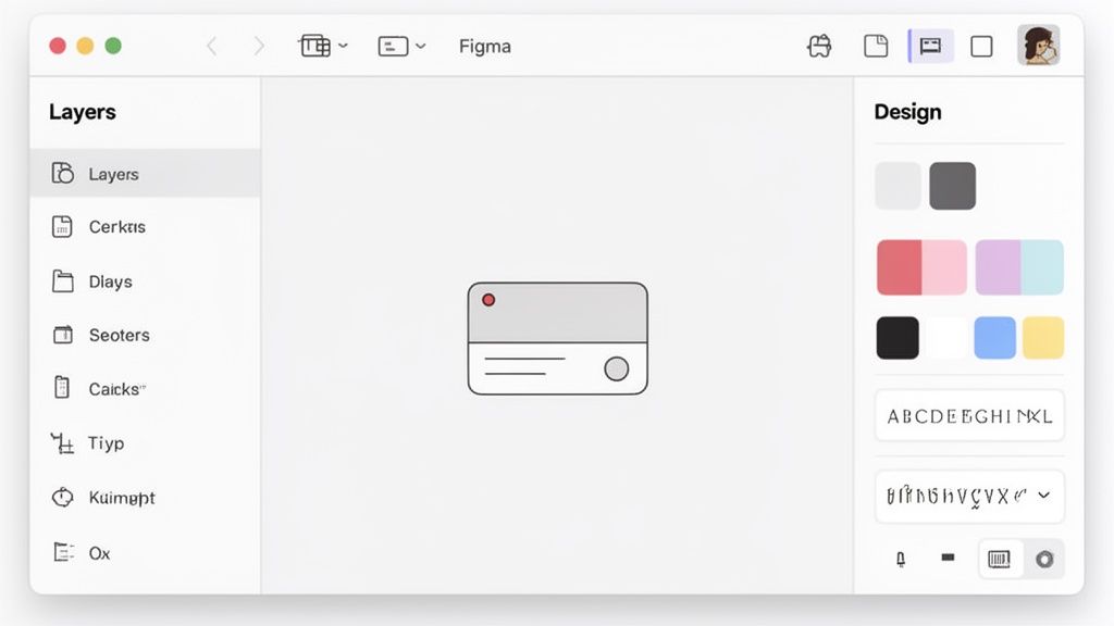
Opening a new design tool for the first time can feel a little overwhelming—like sitting in a cockpit full of unfamiliar buttons. Let's get you comfortable with the Figma workspace. We'll skip the dry feature list and take a practical tour of what you actually need to know.
When you look at a Figma file, you'll immediately notice it's split into three main areas. On the left is the Layers Panel, the massive Canvas sits in the middle, and the Properties Panel is on the right. I like to think of it as an artist’s studio: your layers are how you organize materials, the canvas is where you create, and the properties panel is where you find all your paints and brushes.
Your Creative Command Center
The Layers Panel on the left is so much more than a simple list. It's the entire command center for your design file. Every single thing you add—from a tiny icon to a full-screen layout—shows up here in a neat, hierarchical list. Trust me, getting into the habit of keeping this panel organized is one of the best things you can do as a new designer.
For example, if you're designing a mobile app, you might have separate frames for your "Login Screen" and "Home Screen." Inside that "Home Screen" frame, you'll then see the individual layers for the status bar, buttons, and text fields. This organized structure makes it incredibly easy to find and tweak a specific element without having to hunt for it on the canvas.
A clean Layers Panel is the mark of a pro. Get in the habit of naming your layers descriptively—like "Primary CTA Button" instead of "Rectangle 5." It feels like a small thing, but it will save you a massive amount of time later.
The Canvas and Properties Panel
The giant canvas in the center is your creative playground. It's an infinite, zoomable space where all the design magic happens. You can pan around by holding the spacebar while you click and drag. This is a shortcut you'll commit to muscle memory within your first hour.
Over on the right, the Properties Panel is your main toolbox. This panel is dynamic, which means its contents change depending on what you've selected. If you click on a text layer, you'll see options for font, size, and alignment. If you select a shape, you'll see controls for its fill, stroke (outline), and effects like drop shadows.
Here’s how these two areas work together in a real-world scenario:
- Action: You draw a rectangle on the Canvas to act as a button.
- Response: The Properties Panel instantly updates to show you options for that rectangle.
- Result: You use the Fill control to change its color, add a Stroke for a border, and tweak the Corner Radius to give it nice, rounded corners.
This back-and-forth between the Canvas and the Properties Panel is the core workflow in Figma. It's a fast, fluid process that lets you see your design decisions happen in real-time. Getting comfortable with this flow is a huge step toward mastering the tool.
Mastering the Essential Tools for Any Design
No matter how complex a design looks, it always boils down to a few fundamental building blocks. In this part of our Figma journey, we're getting hands-on with the core tools you’ll find yourself reaching for constantly: Frames, Shapes, and the Text tool.
Think of this as building muscle memory. My goal is to get you comfortable with how these simple tools work together to create something that looks professional, right from the very beginning.
Structuring Your Work with Frames
Before you even think about drawing a button or typing a headline, you need a canvas for your work. In Figma, that canvas is a Frame. Don't just think of it as an artboard; it’s a smart container that represents a real device screen, like an iPhone or a web browser.
One of the very first things I do when starting a project is set up my main Frames. Let’s imagine I'm designing a new mobile app. Instead of just guessing and drawing a rectangle, I hit the F key. This brings up the Frame tool, and the Properties Panel on the right instantly shows a list of device presets.
- Action: I'll choose "iPhone 14 Pro" from the preset list.
- Result: Just like that, Figma drops a perfectly-sized Frame onto my canvas.
This quick step makes sure my design starts with the correct dimensions from the get-go, which is a game-changer for creating realistic UIs. You can create as many Frames as you need for different screens—think "Login," "Home," and "Profile"—which keeps your file tidy and preps it for prototyping down the line.
A classic rookie mistake is using Groups when you should be using Frames. A Frame has its own dimensions and can clip the content inside it, which is crucial for responsive design. A Group is just a simple folder for layers. Always start your screens with a Frame.
Building Visuals with Shapes
Okay, our canvas is ready. Now it’s time to add the visual meat and potatoes. The Shape tools are your go-to for creating everything from buttons and icons to more complex illustrations. You’ll find them in the top toolbar—just click the rectangle icon to see options for lines, ellipses, stars, and more.
Let’s put this into practice with a quick exercise. We'll build a simple "play" icon.
- Press
Rto grab the Rectangle tool and draw a square. Pro-tip: hold Shift while you drag to make it a perfect square. - Now, hit
Ofor the Ellipse tool and draw a circle around your square. - Finally, press
Pto activate the powerful Pen tool. Click three points to draw a triangle inside the circle, and then hit Enter. - You can now select and delete the square and circle you used as guides.
In just a few seconds, you've made a custom icon. From here, you can start experimenting in the Properties Panel. Try changing the Fill color, removing the Stroke (the outline), or rounding the corners of your shapes. The best way to learn is by doing.
Communicating with the Text Tool
The last of our core trio is the Text tool. Just press T, click anywhere on your canvas, and start typing. But putting words on the screen is just the first part. The real design work comes from creating a clear visual hierarchy that tells the user what to read first.
To get this right, I focus on a few key properties in the right-hand panel. For a main headline, I might go with a bold, heavier font like Inter Bold set to 32px. For the regular body text, I’ll switch to Inter Regular at 16px. That immediate contrast does a ton of work guiding the user's eye. Don't be shy about experimenting with font weight, size, and color to establish a clear order of importance.
Building Your First Project: A Modern Landing Page
Alright, let's move past the theory and get our hands dirty. The best way to make the lessons from this Figma tutorial stick is by building something real. We're going to create a project you can actually show off: a clean, modern landing page.
This is where you'll see how Figma's tools come together to create a tangible design. We'll build a complete page from the ground up, tackling a simple navigation bar, a powerful hero section, and a feature area with icons and text.
Setting Up the Landing Page Frame
Every design needs a canvas. In Figma, that's a Frame.
Start by pressing the F key to grab the Frame tool. Look over to the Properties Panel on the right, and you'll find a bunch of device presets. For this project, a desktop size makes sense—let's go with Desktop and then select MacBook Pro 14". It's a common and reliable starting point.
You now have a blank slate perfectly sized for a typical laptop screen. Starting with a realistic frame size keeps your design grounded from the get-go. As you start laying things out, you can save a lot of time by studying how professionals structure their initial ideas. Exploring resources like Figma wireframe templates can seriously speed up your workflow.
With our frame set, we'll block out the main sections of a standard landing page:
- A Navigation Bar across the top.
- The Hero Section right below it to make a strong first impression.
- A Features Section to outline the key benefits.
We'll build these one by one, starting with the hero. Use the Text tool (T) to write a bold headline, then grab the Rectangle tool (R) to draw a button underneath it. Don't stress about making it perfect just yet; we're just getting the basic elements in place.
The Magic of Auto Layout
Now for the game-changer: Auto Layout. This is the feature that makes your designs flexible and responsive, and it's a non-negotiable part of any modern designer's workflow.
Let's try it on the button you just created. Select both the button's text and its rectangle background, then hit Shift + A. Figma instantly wraps them in an Auto Layout frame. Go ahead and change the button's text—see how the background resizes automatically? This one trick saves you from endless manual tweaks.
Auto Layout is probably the single most important concept for a beginner to master. It’s the secret to building components that are reusable and scalable, which is what professional design is all about.
The impact of Auto Layout on efficiency is huge. In fact, 62% of designers say it reduces their prototyping time by as much as 40%. With 68% of web designs expected to be mobile-responsive by 2026, getting comfortable with this feature is essential. You can find more details about how tutorials focus on this critical skill in these Figma tutorials.
At its core, the Figma design process is simple. You start with a Frame, add your Shapes, and then bring it to life with Text.
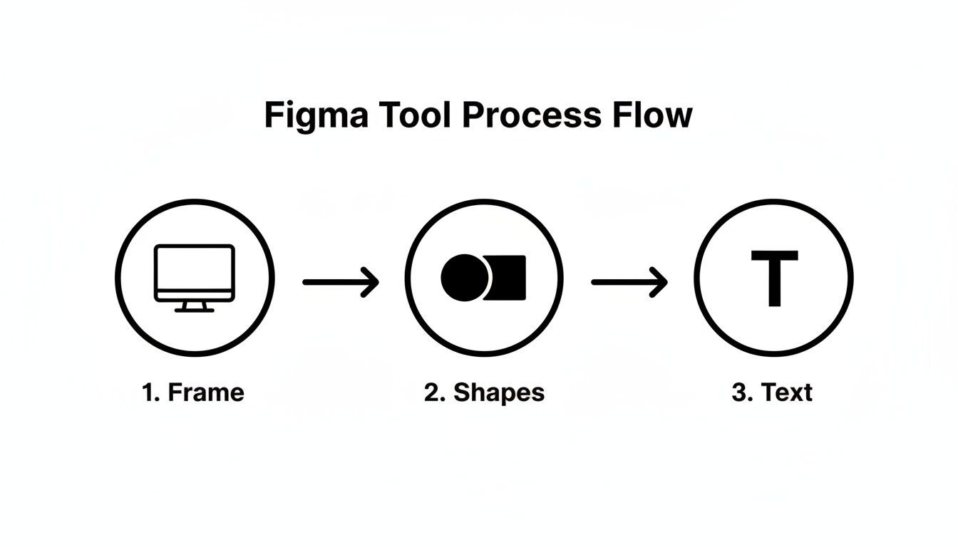
This three-step workflow is the foundation for almost every screen you'll ever create.
Completing the Feature Section
Let's finish up by building out that feature section. Create three small icons (simple circles will do for now) and place them in a row. Under each icon, add a short headline and a bit of descriptive text.
Now, select one icon and its text, and use Shift + A to apply Auto Layout. Do this for all three pairings. Finally, select all three of your new Auto Layout groups and hit Shift + A one more time. Just like that, you have a perfectly spaced, responsive section that you can easily adjust.
By building this landing page, you’ve done more than just follow a tutorial. You've applied core design principles using powerful, professional-grade tools. If you're ready to add some more advanced visual flair, check out our guide on creating a Figma glass effect.
Bringing Your Static Design to Life with Prototyping
A static design is really just a blueprint. It shows where everything goes, but it doesn't give you a feel for how the product actually works. This is where we get into one of Figma's most powerful features: turning that flat landing page into a clickable, interactive experience. This is the part of the process that makes your design finally feel alive.
To get started, we'll switch from the Design tab to the Prototype tab. You'll find it in the Properties Panel on the right side of the interface. This is your command center for connecting the dots and defining how a user will move through your creation.
Creating Your First Interaction
Let's stick with the landing page project we just built. The goal here is to simulate a simple user journey. For instance, when a user clicks our main call-to-action button, we want to show them a "Sign-Up" confirmation screen.
Of course, you need another screen to link to. Just duplicate your landing page Frame (select it and press Cmd/Ctrl + D) and quickly change the text to create a sign-up confirmation page. Now you have a starting point and a destination.
With the Prototype tab still active, click on the call-to-action button in your original landing page Frame. See that small blue circle that appears on its right edge? That's your interaction point, often called a "noodle."
Dragging this noodle from your button over to the second Frame is the fundamental action of prototyping in Figma. It's an incredibly intuitive way to tell Figma, "When this button is clicked, take the user to this screen." You're literally mapping out the user flow.
As soon as you connect the two Frames, the Interaction details panel will pop up. This is where you define the specifics of how the prototype works.
- Trigger: Set this to On Click. This just means the action happens when a user clicks the button.
- Action: Keep this as Navigate To, which is exactly what we want for moving between screens.
- Animation: Here’s where the real magic happens. Let's look at that next.
Making Transitions Feel Professional
Just jumping from one screen to the next can feel abrupt and cheap. To create a much more polished experience, Figma gives you some great animation options. In that same Interaction details panel, find the Animation setting and select Smart Animate.
Smart Animate is brilliant. It automatically looks for matching layers between your start and end Frames and creates buttery-smooth transitions for them. If a button changes color or an image changes size between the two screens, Smart Animate will fluidly animate those properties for you. This one feature can make your very first prototypes look like they were built by a seasoned pro.
With just a few clicks, you now have a shareable prototype ready to send out for feedback. A beginner can get the hang of linking frames and creating basic interactions in about 15 minutes—a skill that can save development teams roughly 25% of their time down the line.
For more hands-on lessons, check out these excellent Figma courses and tutorials. You can also speed up your work by exploring some of the most popular Figma plugins and resources.
Your Common Figma Questions Answered
As you start getting comfortable with Figma, you’ll inevitably run into a few questions. This happens to everyone. Let's clear up some of the most common ones right away so you can keep moving forward with confidence.
Is Figma Really Free for Beginners to Use?
Yes, and the free plan is incredibly generous. Figma's "Starter" plan is completely free for individuals and includes everything you need to follow this guide and build out your own portfolio.
You get unlimited personal files and can even collaborate with others. The paid plans are really for professional teams that need things like shared component libraries, detailed user analytics, and advanced project permissions. As someone just starting out, you won't hit a paywall.
What Is the Difference Between a Frame and a Group?
This is a big one that trips up nearly every new designer. On the surface, frames and groups look similar, but they have fundamentally different jobs.
- A Group is just a simple folder. It lets you bundle a few objects together so you can select and move them all at once. That's about it.
- A Frame is a powerful container that acts as a canvas, like an artboard. Frames are the foundation for building responsive designs with Auto Layout, defining your prototype screens, and creating organized components.
As a rule of thumb, always use a Frame when creating a distinct UI element, whether it's an entire screen, a button, or a user profile card. A project built with Frames instead of Groups is the mark of a clean, professional workflow.
Can I Work on My Figma Designs Offline?
You can! While Figma is built for the cloud, you're not out of luck without an internet connection. Just make sure you download the official desktop app for Mac or Windows.
Any file you've opened in the app before will be cached and available for you to edit, even if you go offline. As soon as you reconnect to the internet, all of your changes sync up automatically. It gives you the power of real-time collaboration without the fear of being stranded by spotty Wi-Fi.
How Do I Show My Design to Someone Without a Figma Account?
Sharing your work with stakeholders or developers is simple. Figma allows you to generate a special "view-only" link that lets anyone see your design.
They just open the link in their browser—no account, sign-up, or installation required. This is perfect for client feedback or developer handoff, as viewers can inspect every design property (like colors, spacing, and font sizes) and even export assets directly from the file.
At Creators Toolbox, we're dedicated to bringing you the best tools and guides to help you succeed. For a weekly dose of design news, resources, and tutorials, check out our free platform at https://creatorstoolbox.co.