Write an AI Creative Brief With Testable Constraints
By Steven Van ·
Turn vague AI image requests into a testable creative brief with priorities, composition rules, delivery checks, and a worked before-and-after prompt.
AI-generated conceptual illustration; not a product screenshot, measured result, or factual diagram.
“Make it bold, welcoming, and professional” describes a hope. It does not tell an image model where the subject belongs, what must remain legible, or which details would make the result unusable. It also gives the reviewer little basis for explaining why one output succeeds and another does not.
A testable AI creative brief connects the communication goal to observable requirements. It distinguishes essential constraints from preferences, identifies what the generation tool should produce, and reserves exact finishing work for the right part of the workflow.
This guide rewrites a fictional brief for a banner promoting a neighborhood repair workshop. The exercise is about preparing and evaluating instructions, not claiming that a particular prompt has produced a verified result. The same structure can support illustration, photography-style concepts, or other visual assets, but the worked example stays with one bounded deliverable.
Start with the job the image must do
The workshop banner needs to help a visitor understand that the event involves repairing everyday objects with other people. It will sit behind a short headline and a registration button on a landing page. The image's job is to establish the activity and tone without competing with those interface elements.
That goal immediately rules out several attractive but unhelpful directions. A close-up of a shiny tool may look polished but fail to communicate community participation. A busy room full of tiny objects may establish a workshop but make the headline hard to read. A generated poster with all event details embedded in the image may be difficult to edit and inaccessible as the sole source of information.
Write the purpose in one sentence: “Show two adults inspecting a desk lamp together, with clear open space for a separately typeset event headline.” This is more actionable than a list of adjectives because it names the subject, relationship, and layout need.
Keep the audience description relevant. You do not need an invented persona with a detailed biography. For this task, it is enough to know that the page addresses people deciding whether to attend a beginner-friendly community event.
Separate requirements from preferences
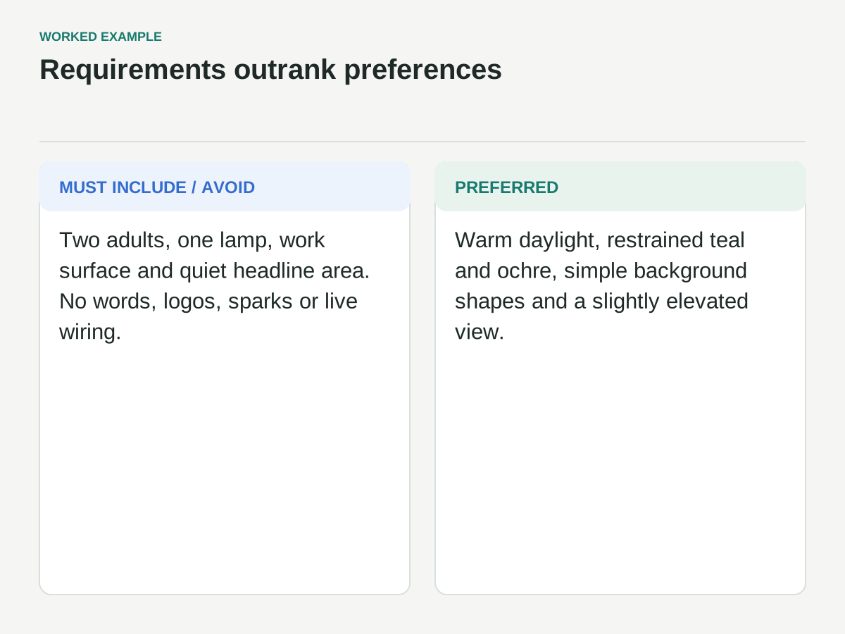
Put requirements into three groups: must include, must avoid, and preferred. A requirement should have a clear reason connected to the deliverable. A preference should be negotiable without making the image fail its purpose.
For the repair banner, must include means two adults, one recognizable desk lamp, a visible work surface, a cooperative inspection gesture, and open space on the left for the headline. Must avoid means embedded words, logos, sparks, exposed live wiring, and extra foreground people that obscure the activity.
Preferred means warm daylight, a restrained teal-and-ochre palette, simple background shapes, and a slightly elevated viewpoint. Those choices support the desired feeling, but a strong composition should not be rejected solely because the light is more neutral than expected.
This hierarchy matters when instructions compete. If the model can satisfy the warm atmosphere only by filling the left side with a bright window, the headline space still takes priority. The brief should make that tradeoff explicit before review begins.
Convert adjectives into visible decisions
Take each vague term and ask what a reviewer would point to in the image. “Welcoming” could mean cooperative body language, an uncluttered scene, and ordinary everyday objects rather than intimidating industrial equipment. “Bold” could mean a clear silhouette and large color areas rather than aggressive expressions or oversized lettering.
“Professional” is especially ambiguous. In this project, define it as clean edges, coherent object construction, controlled background detail, and an image that survives the required crop. Do not assume it means suits, luxury materials, or a corporate office.
The goal is not to ban emotional language. It is to connect it to observable choices. Keep the adjective as a summary if it helps, then add the visual interpretation that applies to this project.
Avoid false precision. A requirement such as “the image should feel exactly 70 percent friendly” is not testable simply because it includes a number. A proportion can be useful for a layout region, but a numerical score does not turn an undefined impression into an objective property.
Specify the composition in a way you can inspect
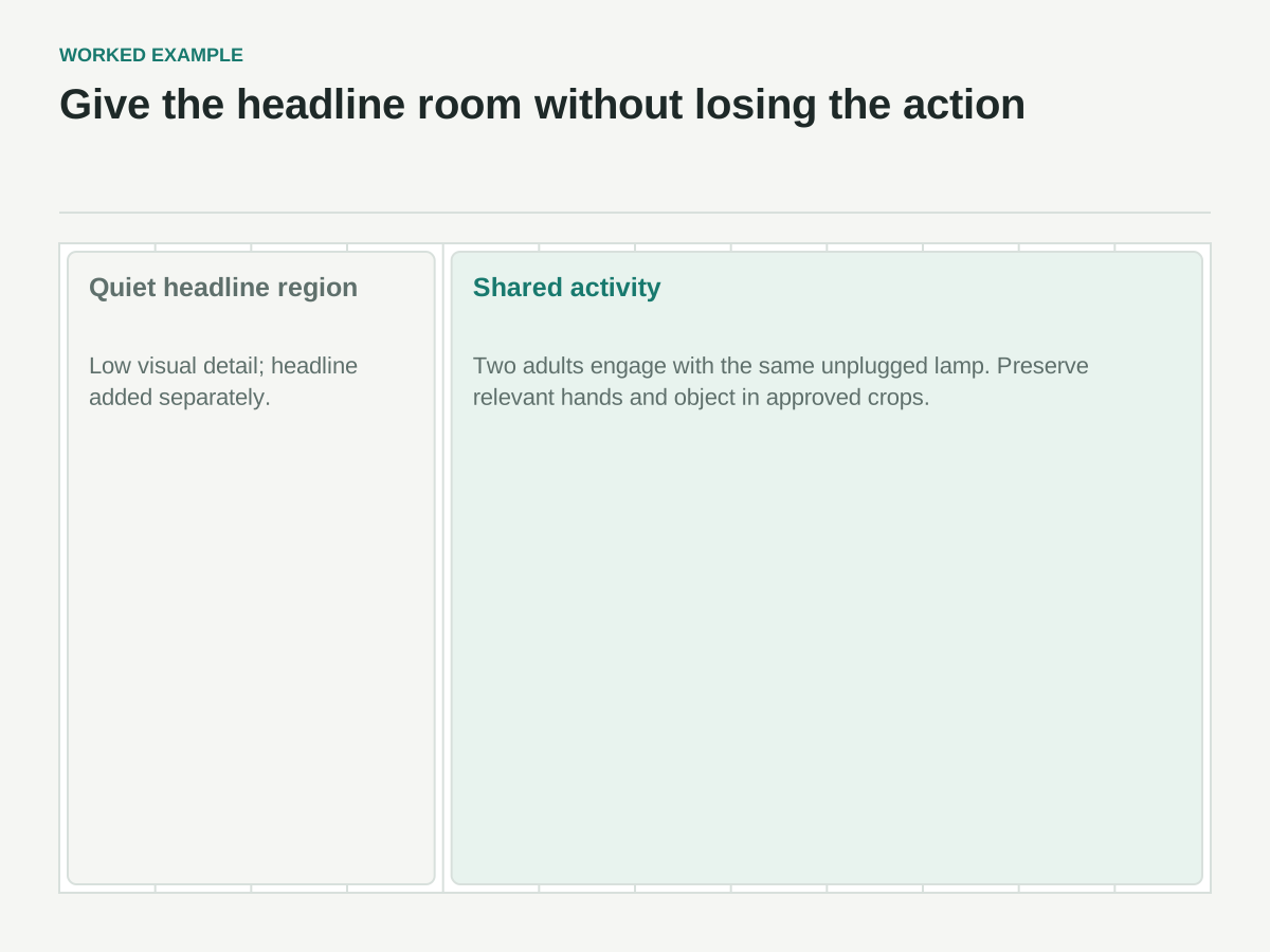
For the banner, propose a wide composition with the people and lamp mainly in the right half. Keep the left third low in visual detail so the separate headline has a usable background. Allow a transition area between the empty region and the main scene rather than demanding an abrupt invisible boundary.
Describe the focal relationship: both people should appear engaged with the same lamp. One points to its base while the other steadies it. That helps distinguish collaboration from two unrelated figures standing near a table.
State what must survive alternative crops. If the site will use a narrower mobile crop, the lamp and both people's relevant gestures should remain within the chosen safe region, or the mobile layout should use a separate crop or asset. Do not assume a single wide image can preserve every element in every aspect ratio.
Use a simple layout sketch if the tool accepts references, but keep the brief understandable without it. The written requirement should explain the sketch's purpose: subject placement and clear headline area, not the rough drawing style.
Separate generation from exact finishing
An image model may produce a strong composition while missing an exact dimension, text spelling, or pixel-level layout requirement. Check the capabilities of the chosen tool before treating the prompt as a complete production system. OpenAI's image-generation documentation describes supported generation and editing workflows and notes limitations around precise composition and consistency.
For this banner, ask the model for an illustration without text. Add the headline, date, and registration button in the website or design layout, where they can be edited and checked independently. That also keeps essential event information available as actual text rather than only as pixels in an image.
Record the final delivery requirements separately: intended aspect ratio, export format, color handling appropriate to the destination, maximum file size if the project has one, and any responsive variants. Some are generation settings; others require cropping, export, or implementation work afterward.
A prompt that asks for an exact file size does not verify that the exported asset meets it. The brief should name the check and the stage where it happens, rather than pretending all delivery requirements can be enforced by descriptive language.
Rewrite the weak brief
The starting brief is: “Create a bold, welcoming, professional hero image for our repair event. Make it modern and engaging, with room for text.”
A stronger version reads: “Create a wide editorial illustration for a community repair-workshop landing page. Show two adults cooperating over one mustard-yellow desk lamp on a simple workbench. Keep the people, lamp, and meaningful hand gestures mainly on the right. Leave the left third visually quiet for a headline that will be added separately. Use flat shapes, clean edges, a cream background, and restrained teal and ochre accents. Show the lamp unplugged and the action as inspection. Do not include words, logos, sparks, exposed live wiring, or extra foreground people. Prioritize a recognizable shared activity and usable headline space over decorative background detail.”
That revision is longer, but its value is not length. Each sentence resolves a choice that the original brief left open. It tells the model what the image is for, what to show, how to arrange it, which visual language to use, and what would undermine the result.
A still longer prompt is not automatically better. Remove instructions that repeat the same idea or introduce a second aesthetic direction without a clear purpose.
Build the review checks before generating
Turn the requirements into a small acceptance list. For the fictional banner, the first pass asks whether the main activity is recognizable, the headline region is usable, the lamp and hands are coherent, and prohibited elements are absent.
Then review preferences: palette, warmth, background simplicity, and overall balance. This order prevents a beautiful color treatment from distracting the reviewer from a missing or unusable core requirement.
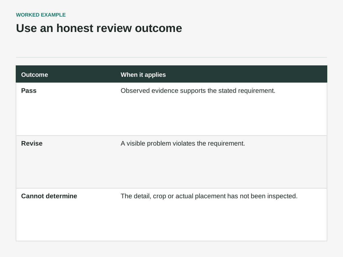
Use three possible outcomes for each requirement: pass, revise, or cannot determine. “Cannot determine” is valuable when the image is too small to inspect or the crop is not yet available. It is more honest than approving an unseen detail.
Attach evidence to important failures. “Left third contains a dark shelf that interferes with the overlaid headline” is actionable. “Not modern enough” sends the next iteration back into ambiguity. If a requirement cannot be reviewed clearly, revise the requirement before generating more candidates.
A review record for the banner
These are proposed checks, with no generated candidate approved. Use pass, revise, or cannot determine after inspecting the actual result in its placement.
| Constraint | Evidence needed | Current state |
|---|---|---|
| Two adults inspect the same unplugged lamp | Image at useful inspection size; coherent object and hand relationships | Pending generation/review |
| Subjects mainly right; left third quiet | Image with the actual headline and button placed in the page layout | Pending placement review |
| No embedded words, logos, sparks or extra foreground people | Full image inspection, including small background regions | Pending image review |
| Important action survives mobile placement | Approved mobile crop or separate asset in the narrow layout | Pending crop review |
| Palette and warm light are preferences | Side-by-side art-direction review after requirements pass | Pending judgment |
Also verify actual headline contrast and legibility in the page. A quiet region alone does not guarantee readable overlay text, and the brief has not specified a white headline.
Change one class of problem at a time
Suppose the first candidate has a strong cooperative scene but the lamp is cropped off the bottom. Do not simultaneously change the palette, camera angle, rendering style, and number of people. First address framing while preserving the successful parts.
If the tool supports editing, ask for a bounded correction and compare the result with the previous candidate. If it does not, revise the relevant instruction while keeping the rest of the brief stable. Save both the input and the output so you can see whether the change helped.
A useful iteration note contains the observation, proposed change, and expected effect. For example: “The lamp base falls outside the safe crop. Move the workbench and lamp slightly upward while preserving the two-person arrangement. Expected result: complete lamp remains visible in both approved crops.”
This is a hypothesis, not proof that the next generation will obey. After every revision, recheck the essential requirements because solving one problem can introduce another.
Handle conflicts explicitly
Sometimes the brief asks for incompatible outcomes. A highly detailed workshop, a large two-person interaction, and a completely empty half of a narrow image may not coexist comfortably. Repeated generation is an expensive way to avoid that design decision.
Identify the conflict and choose what can change. The banner might use a simpler setting, a different crop, or a separate mobile composition. The correct choice depends on the communication goal and placement, not on which prompt wording sounds most forceful.
Also question exclusions that merely reverse a preference. “No clutter” is vague; “no more than three background objects visible on the workbench” is more inspectable, though exact counting may still need manual review. Use the level of specificity that helps the task without creating brittle requirements for irrelevant details.
If a detail is mandatory for factual, brand, or production reasons, plan a reliable finishing step or human review. Do not assume stronger wording turns a probabilistic generation process into a deterministic layout engine.
Keep the approved brief with the asset
Store the final brief, reference files, generation settings, selected output, and review notes together. Include the crop or page mockup used for approval. An image that passed in a wide preview may fail in the actual placement.
Record which requirements were satisfied directly and which were completed during finishing. That distinction helps the next collaborator know whether they can regenerate the asset or need to preserve a manually adjusted version.
The final brief should be short enough to use and specific enough to evaluate. It does not need to predict every pixel. It needs to protect the purpose, expose the important tradeoffs, and make the next revision clearer than “try again, but better.”