Master How to Draw an Isometric Drawing
By Steven Van ·
Learn how to draw an isometric drawing. Our guide covers fundamentals, grids, digital tools, shading, & avoiding mistakes. Start now!
You’re probably staring at a blank page, a new Figma frame, or a half-finished sketch and thinking the same thing most beginners think. Why does isometric art look so clean when other people do it, but awkward when I try?
That usually happens for one of two reasons. Either the angles drift, or the drawing starts as a 3D idea but gets built with 2D habits.
The fix is not talent. It’s structure.
When people ask me how to draw an isometric drawing, I tell them to stop thinking about “style” first. Start with the system. Once you understand the grid, the cube, and the logic behind circles and shading, the whole process gets much calmer. You stop guessing. You start constructing.
This guide walks through that process the way I’d teach a junior designer sitting next to me. We’ll start on paper, move into digital tools, and deal head-on with the part most tutorials skip, which is how to draw circles, holes, and rounded forms without breaking the illusion.
The Fundamentals of Isometric Projection
Isometric drawing works because it gives you a 3D-looking object on a 2D surface without perspective distortion. That last part matters. In perspective drawing, lines converge toward vanishing points, so objects appear smaller as they move away. In isometric drawing, lines stay parallel. That means you can build forms that feel spatial but remain easier to measure, repeat, and edit.
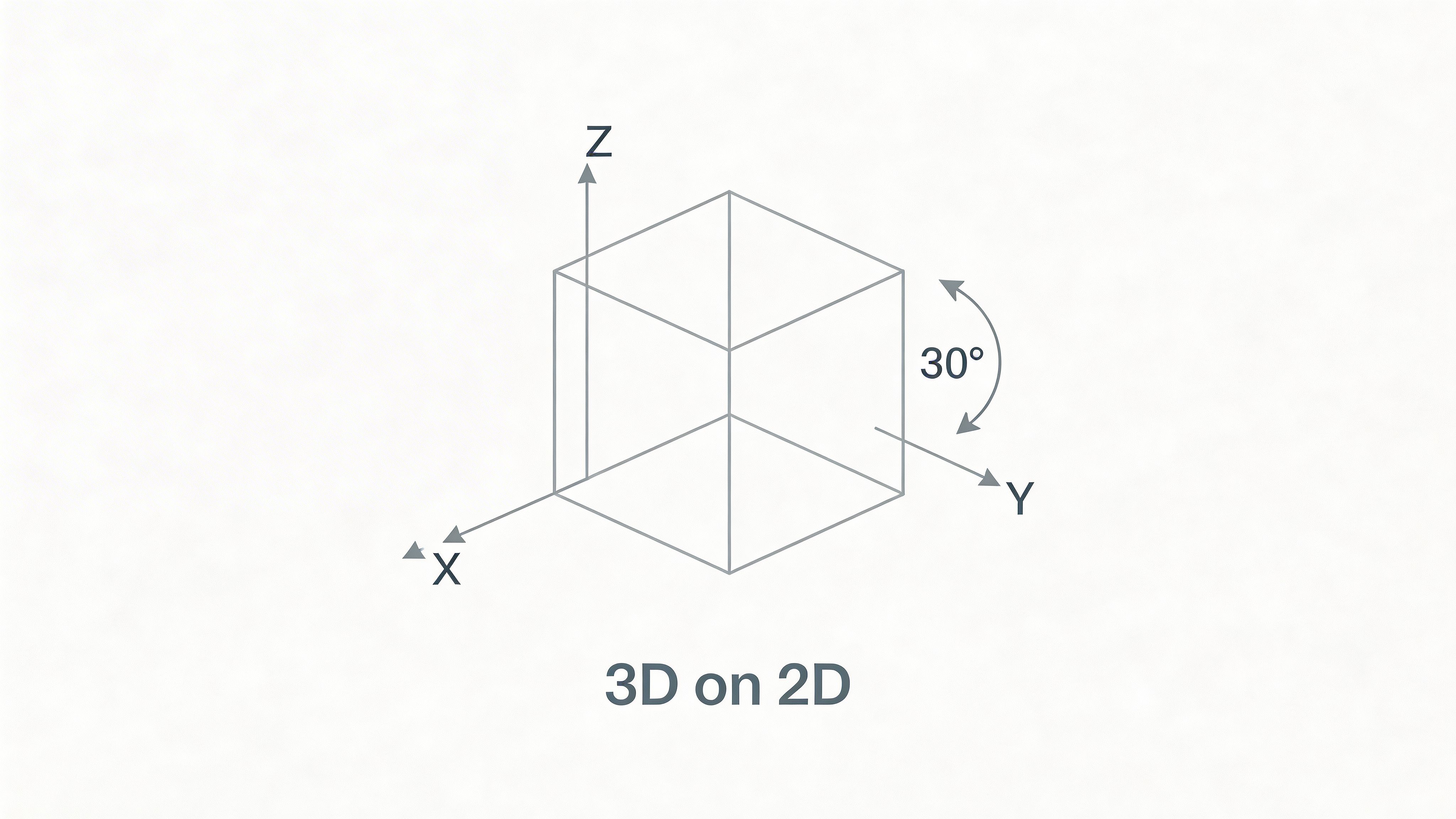
The core rule is simple. The x, y, and z axes sit at 120° from one another, and the method was formalized in the 19th century. The term comes from the Greek “isometros,” meaning “equal measure,” which fits because all three axes use equal foreshortening and parallel lines instead of vanishing points, as noted in this guide to isometric drawing.
Why it feels different from perspective
In perspective, you draw what the eye sees. In isometric, you draw what the structure is.
That’s why isometric drawing is so useful for icons, product diagrams, room layouts, game assets, and technical illustrations. You can stack shapes, duplicate modules, and keep proportions consistent without constantly recalculating depth.
A beginner often gets confused here and asks, “So isometric is less realistic?” Visually, yes. Structurally, no. It is less optical and more controlled.
The angle logic that keeps everything stable
Most artists don’t draw all three axes directly. They use one vertical axis, then draw the two receding axes at 30 degrees from horizontal. That creates the familiar isometric setup while still preserving the 120° relationship between axes. The logic is:
- Vertical lines stay vertical
- Left-facing depth lines follow one consistent 30° angle
- Right-facing depth lines follow the mirrored 30° angle
- Parallel edges in the object stay parallel in the drawing
That last point is where the style gets its clean, engineered look.
Tip: If your drawing starts to look “sort of 3D but weird,” your problem is usually not the shape. It’s that one family of lines stopped staying parallel.
Why old geometry still matters in modern design
Isometric projection has deep roots, but it still fits modern workflows because it solves a current problem. Designers need a way to show depth clearly without making assets hard to edit.
That’s why isometric shows up in product illustrations, dashboards, maps, explainer graphics, and game environments. It gives you a consistent visual world. Once you learn the logic once, you can use it almost anywhere.
If you understand this section, the rest of the process becomes mechanical in a good way. You’re no longer “drawing 3D.” You’re placing measured lines on a predictable system.
Setting Up Your Isometric Drawing Grid
A good isometric drawing usually feels easy to draw because the setup did most of the work first. If the grid is solid, your hand can relax. If the grid is sloppy, every line becomes a judgment call.
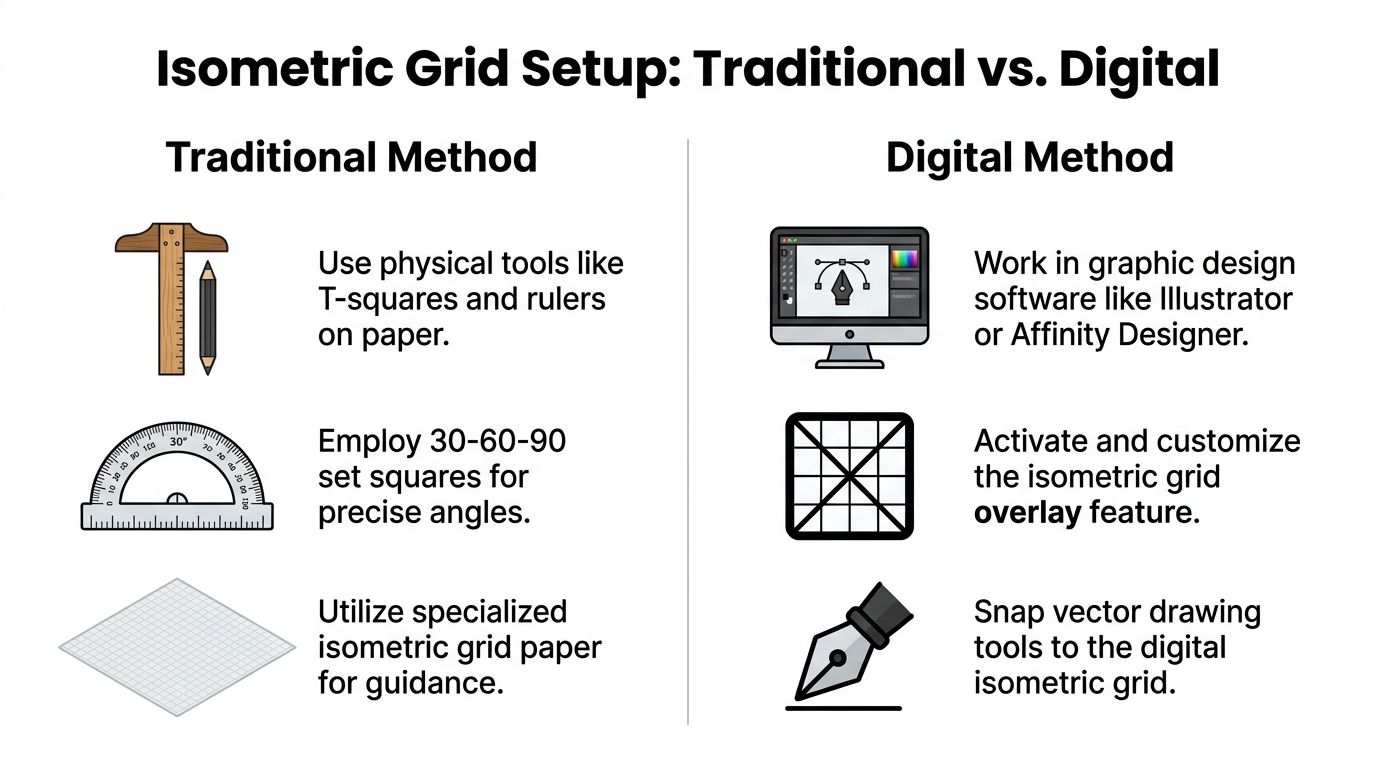
Traditional setup on paper
If you’re working by hand, the simplest route is isometric graph paper. The triangular pattern gives you built-in guides for the angled axes, which removes a lot of hesitation.
Manual drafting also gets more accurate when you stop eyeballing. Using a protractor and gridded paper yields 98% dimensional accuracy, and technical drawing curricula show that an isometric grid can reduce drawing time by 50% compared with freehand attempts, according to Creative Bloq’s isometric drawing overview.
For a clean paper workflow, I recommend this tool stack:
- A hard pencil first: Use a light line so you can correct structure before inking.
- A ruler or T-square: Keep verticals honest. Wobbly verticals make the whole drawing lean.
- A 30-60-90 set square or protractor: You want the receding lines consistent every time.
- Isometric paper: It removes guesswork, especially if you’re still learning shape construction.
Building your own guide if you do not have isometric paper
You can build a simple working grid from scratch.
- Draw a vertical baseline.
- From the bottom, use your set square or protractor to draw one line at 30° to the left and one at 30° to the right.
- Repeat these directions lightly across the page.
- Add evenly spaced verticals where needed.
You do not need a full-page perfect lattice to start. For many drawings, a local construction grid around the object is enough.
Digital setup in Illustrator, Affinity Designer, and Figma
Digital tools change the labor, not the geometry. The goal stays the same. You want dependable 30° directions, clean snapping, and a layout that helps you separate planes instead of mixing them.
Here’s the practical difference between the main tools:
| Tool | Best use | What to set up first |
|---|---|---|
| Adobe Illustrator | Vector icons, polished marketing art | Grid or angled guides, snap behavior, duplicate transforms |
| Affinity Designer | Plane-based isometric drawing | Isometric panel, plane switching, snapping |
| Figma | UI mockups, fast concept layouts | Plugins, angled component construction, spacing system |
What to do in Affinity Designer
Affinity Designer is one of the friendliest places to learn isometric drawing digitally because it treats planes as part of the workflow. Turn on the isometric grid, use the plane controls, and draw on the active plane instead of skewing shapes manually afterward.
That matters because it keeps your construction cleaner. You stop faking isometric and start building inside it.
What to do in Figma
Figma does not behave like a dedicated isometric illustration app, but it is still useful for interface scenes, product cards, and simple environments. The fastest approach is to use an isometric grid plugin or create a reusable guide frame with locked angle references.
When working in Figma:
- Build with components: Repeat stairs, tiles, cards, and panels without redrawing them.
- Separate planes by layer groups: Top, left, and right faces should not live in one messy selection.
- Use a base unit: A repeated spacing unit keeps objects aligned when you scale the composition.
One setup habit that saves time later
Name your layers by plane or direction. For example, “verticals,” “left plane,” and “right plane.” That sounds boring until the illustration gets dense.
Key takeaway: The best grid is the one that removes decisions. If you are still deciding your angle on every stroke, your setup is not finished.
Drawing Foundational Isometric Shapes
Most isometric illustrations are just cubes wearing costumes.
That’s not a joke. Buildings, desks, shelves, app cards, machines, and whole rooms usually begin as boxes. If you can draw one clean isometric cube, you can build almost everything else by stretching it, stacking it, cutting into it, or combining several together.
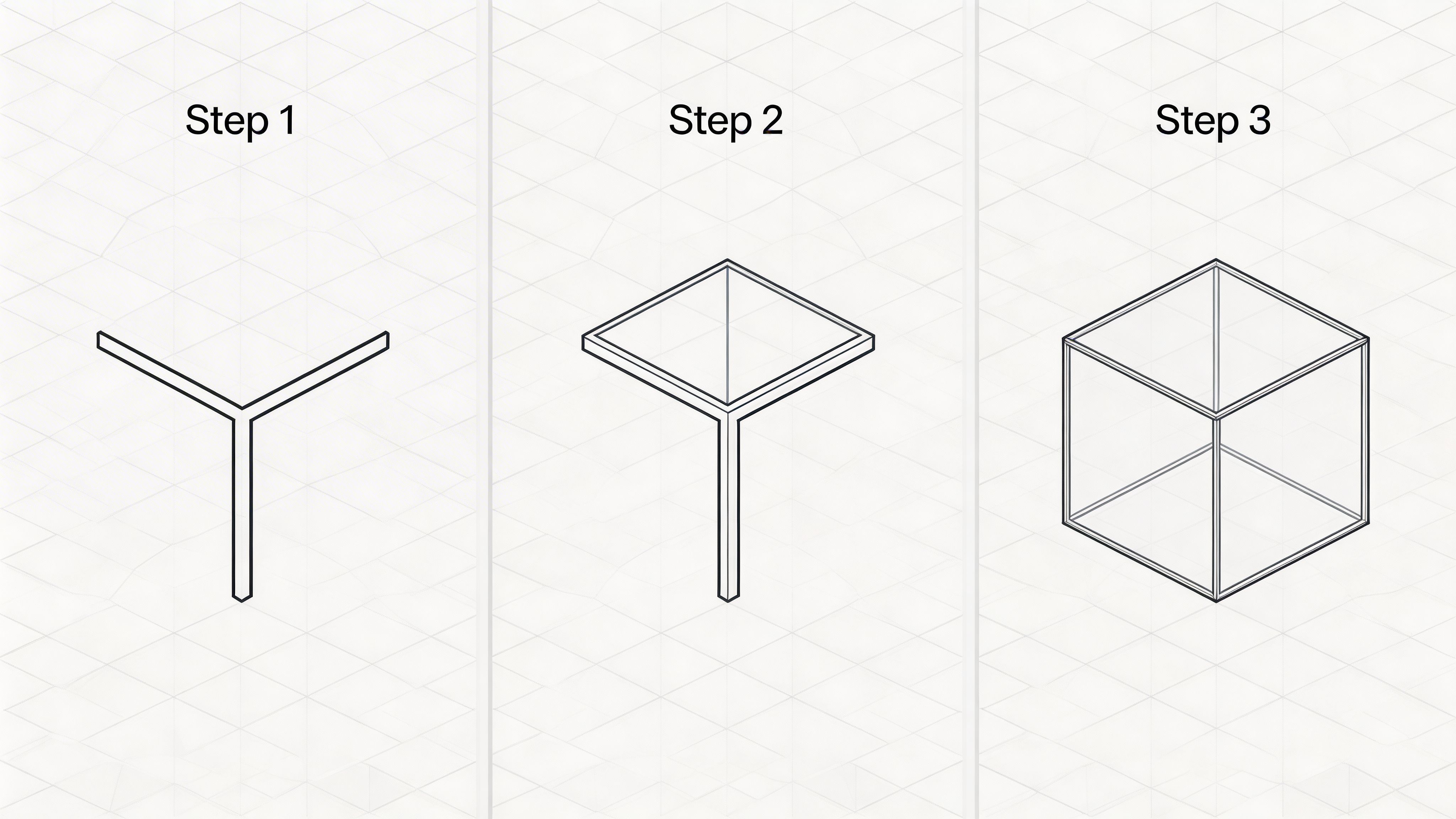
The foundational move is consistent across paper and software. You start with a vertical line for height, then add 30-degree angled lines to establish width and depth. This approach preserves true scaling on an isometric grid, as described in Study.com’s lesson on isometric drawing.
Draw a cube by hand
Use this sequence every time until it becomes automatic.
- Draw a vertical line for the front corner.
- From the top and bottom of that line, draw two lines at 30° in the same direction.
- Decide the width, then close that side with another vertical.
- Return to the top of the first vertical and draw the mirrored 30° line in the opposite direction.
- Close the second side.
- Connect the top edges to form the top plane.
If the cube looks lopsided, check two things first. Are both angled directions consistent, and are the verticals really vertical?
Think in line families, not isolated strokes
A common beginner mistake is drawing each edge as a separate event. That leads to subtle drift.
Instead, sort every line into one of three families:
- Vertical family
- Left-leaning 30° family
- Right-leaning 30° family
When you think this way, the drawing becomes much easier to police. Every new mark has to belong to one family.
Turn the cube into other useful forms
Once the cube is stable, start modifying it.
A few practical examples:
- Stretch it upward and you get a tower, bottle body, cabinet, or room wall
- Stretch it sideways and you get a platform, drawer block, countertop, or bench
- Stack smaller cubes and you get stairs
- Cut one box out of another and you get doorways, windows, or recessed panels
This building-block mindset matters more than memorizing finished objects. You do not need a separate method for every item. You need a reliable way to break objects into primitives.
Tip: Before drawing details, lightly sketch the object as boxes first. If the box version reads correctly, the finished object usually will too.
A quick digital version of the same idea
In vector tools, I build the same cube using line or shape tools instead of drawing freehand. Start with one vertical edge, duplicate along the left and right axes, then close faces with straight segments. In software, precision gets easier when you duplicate edges rather than redraw them.
If you work in Adobe apps, this collection of Adobe Creative Suite tutorials can help if you want to tighten up your shape and pen-tool workflow before moving into more elaborate isometric scenes.
Here’s a visual walkthrough to reinforce the cube logic:
Practice shapes that help
Do not jump straight from a cube to a city block. Practice a short sequence instead:
| Shape | What it teaches |
|---|---|
| Cube | Core axis control |
| Rectangular prism | Proportion and scaling |
| Step form | Repetition and alignment |
| Open box | Interior edges and visibility |
| Simple room corner | Spatial thinking |
If you can draw those cleanly, you’re ready for real objects.
Constructing Complex Forms and Curves
The jump from “I can draw a cube” to “I can draw an object” happens when you start combining forms. Isometric drawing gets fun and engaging here, and where beginners usually start improvising too soon.
You do not need more complicated geometry first. You need better shape decisions.
Build by adding and subtracting volumes
Take a plain box. Add a thinner box to the side and it becomes a cabinet with a side module. Cut a smaller box out of the front and it becomes a doorway or drawer recess. Stack two offset boxes and you have a desk, kiosk, or building mass.
That process is easier if you work from largest to smallest:
- Start with the outer volume
- Add secondary blocks
- Cut openings
- Finish with edge details
If you do details first, you lose the big structure. That’s when drawings feel cluttered even if the lines are technically correct.
Use clear construction for cylinders and pipes
Rounded parts often connect to boxy parts in isometric scenes. Think vents, mugs, wheels, pipes, buttons, handles, or sockets.
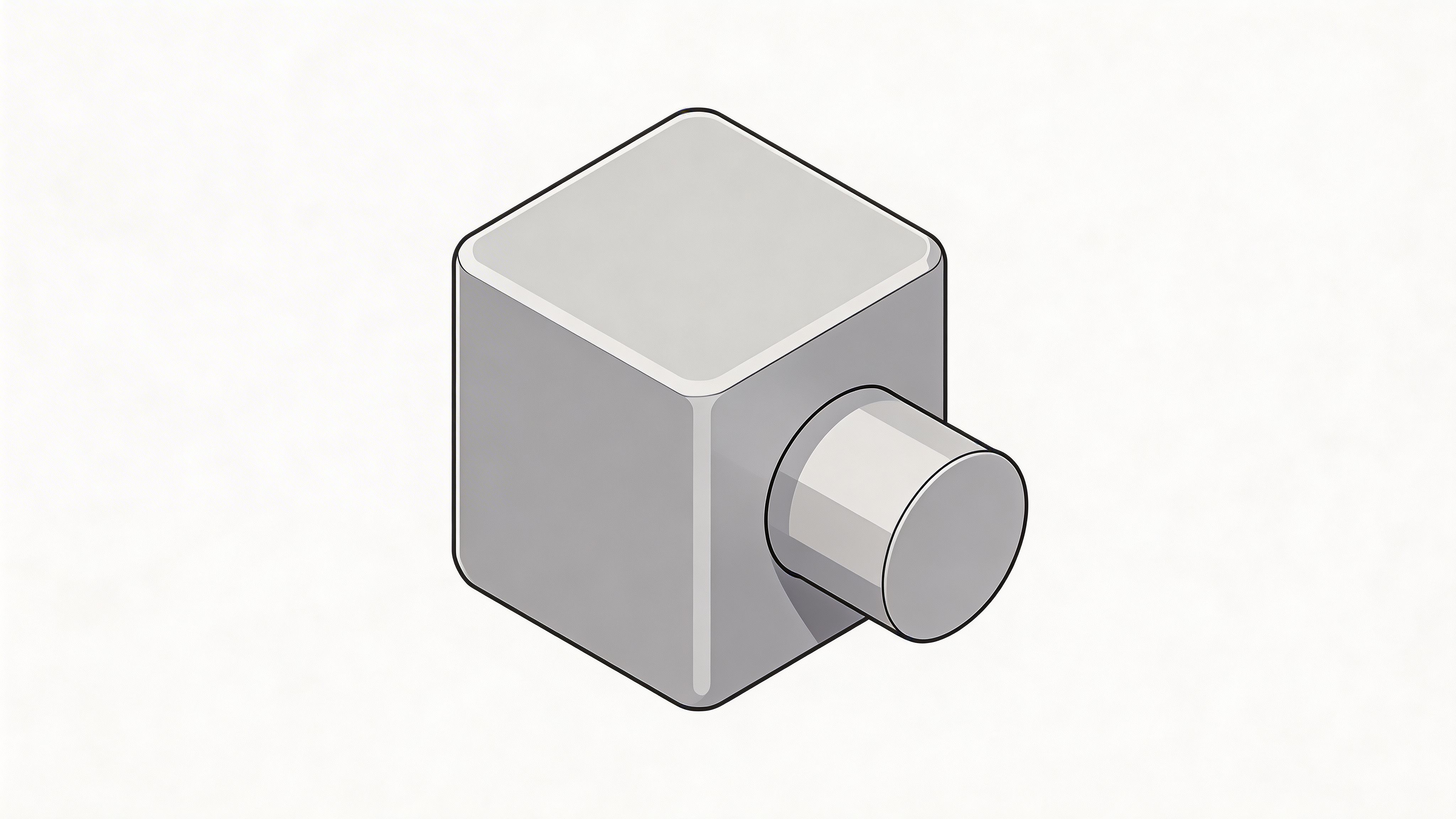
The problem is that circles do not stay circles in isometric view. They appear as ellipses.
This is one of the biggest sticking points for learners. Many tutorials stop at cubes, but forum data from r/IsometricArt shows 40% of help requests involve drawing circles realistically, and the fix is to construct an isometric ellipse where the minor axis aligns with the view plane, as noted in this video reference on isometric ellipse construction.
A reliable method for isometric circles
If you need a circle on an isometric face, do not draw the circle first. Draw the containing square or rhombus first.
Then use this approach:
- Draw the isometric face that would contain the circle.
- Mark the midpoint of each side.
- Lightly draw diagonals to understand the center and directional flow.
- Sketch the ellipse so it touches the midpoints, not the corners.
- Refine the curve so it feels tangent to the edges rather than pinched.
This gives you a believable isometric circle on that plane.
What beginners usually get wrong with ellipses
Most bad isometric circles fail in one of three ways:
- They touch the corners of the containing face, which makes them too pointed
- They lean the wrong way, so the curve ignores the plane it is supposed to sit on
- They become symmetrical like a front-facing oval, which breaks the isometric orientation
A useful mental check is this. The ellipse should feel embedded in the plane, not pasted on top of it.
Tip: If your cylinder cap looks like a football or an eye shape, your curve is probably too sharp at the ends. Round the transitions and recheck the midpoints.
Turning an ellipse into a cylinder
Once you have one ellipse, making a cylinder is straightforward.
- Draw the front ellipse
- Duplicate it along the axis of the cylinder
- Connect the outer tangent edges
- Hide or lighten the rear edge if it would not be visible
That method works for cups, wheels, canisters, pillars, and holes. For a hole instead of a solid form, draw the ellipse opening and then add interior depth lines carefully on the same axis.
Keep curves subordinate to structure
Curves are where people start “winging it.” Resist that. In isometric work, curved forms still need a box or plane underneath them.
If you cannot explain which plane the curve belongs to, the viewer will feel that confusion even if they cannot name it.
Digital Workflows for Isometric Illustration
Hand drawing teaches the logic. Digital tools speed up repetition, editing, and polish.
The trick is not to let software replace understanding. The best digital workflow still follows the same core rule as the paper version. You are managing three axes, three visible planes, and consistent angles. The software just helps you do it faster and more cleanly.
Clip Studio Paint as the model for disciplined setup
A strong digital method comes from illustration software that supports rulers well. In Clip Studio Paint, one of the most accurate approaches is to set up three color-coded parallel rulers for the X, Y, and Z axes and enable 30-degree angle snapping. According to the Clip Studio Paint tutorial, that setup can reach 95-100% angle accuracy and make complex form construction twice as fast as manual grid methods.
That workflow is worth borrowing even if you do not use Clip Studio Paint. The big lesson is organizational, not brand-specific. Separate your axes. Color-code them. Snap aggressively when structure matters.
Illustrator, Affinity Designer, and Figma compared
Different tools help at different stages.
| Tool | Strength in isometric work | Tradeoff |
|---|---|---|
| Illustrator | Clean vectors, strong path editing, easy duplication | You often build the system yourself |
| Affinity Designer | Native-feeling plane workflow | Less common in some team pipelines |
| Figma | Fast layout experiments, UI scenes, collaborative iteration | Less suited to detailed geometric illustration without plugins |
Illustrator workflow that stays editable
In Illustrator, I usually avoid forcing everything through effects at the start. A cleaner approach is to build a small library of isometric primitives first, then duplicate and adjust.
A practical sequence looks like this:
- Draw one cube cleanly
- Save its top, left, and right faces as separate reusable shapes
- Use duplicate, reflect, and align commands instead of redrawing similar faces
- Expand appearance only after the composition is stable
Illustrator is excellent when the final deliverable needs crisp vector output for marketing graphics, diagrams, or icon systems.
Affinity Designer for plane-based drawing
Affinity Designer feels more natural for isometric construction because you can think in planes rather than fake perspective by hand. If you activate the isometric grid and switch planes deliberately, the app helps you place shapes where they belong.
That makes it a smart option for creatives who want vector precision without spending all day building custom guide systems.
The key habit is to draw on the correct plane from the start. Do not draw a flat rectangle and skew it later if the software already lets you target the top, left, or right plane directly.
Figma for product and interface scenes
Figma is not a classic illustration tool, but it’s useful when the final image comes from interface thinking. If you’re building dashboards, app cards, devices, or simple product environments, Figma can work well with a small isometric system.
I usually recommend:
- locking a custom guide grid,
- creating components for repeated blocks,
- and using plugins only where they save repetitive transforms.
This is also where your design-tool budget matters. If you’re still deciding what to use, this roundup of best free graphic design software options is helpful because it frames the tradeoffs between free apps before you commit to one workflow.
iPad and tablet workflows
Tablet work is great for sketching isometric ideas because you can iterate fast, but it gets messy if your guides are weak. If you draw on iPad, use visible angle guides, keep rough construction on its own layer, and separate line art from color early. This guide to drawing on iPad is useful if you want a cleaner mobile setup before committing to finished isometric work.
A process that scales across tools
No matter which app you choose, this process holds up:
- Start with axis guides or an isometric grid
- Block big forms first
- Separate planes into groups or layers
- Add details only after the large volumes read clearly
- Apply color and shadows at the end, not during construction
Key takeaway: The fastest digital workflow is the one that keeps structure editable for as long as possible.
When to choose which tool
If I were advising a junior creative, I’d put it this way:
- Choose Illustrator if final vector polish matters most.
- Choose Affinity Designer if you want the most comfortable dedicated isometric vector workflow.
- Choose Figma if the illustration supports a product, UI, or collaborative design process.
- Choose a ruler-friendly drawing app if your style is more hand-drawn and line-based.
Software should remove friction, not create it. If you find yourself constantly rotating shapes by eye, stop and improve the setup.
Applying Shading Color and Style
A correct isometric drawing can still look flat if every face has the same value. Form becomes believable when light behaves consistently.
The easiest system is to pick one light source and never argue with it afterward.
Use a three-face value rule
Most basic isometric objects show three visible planes. That gives you a simple shading structure:
- Top face gets the lightest value
- One side face gets a mid tone
- The opposite side face gets the darkest tone
That alone adds depth fast. It also keeps complex scenes readable because the viewer learns your light logic right away.
If you keep changing which side is dark from object to object, the illustration starts to feel slippery.
Pick color families before local detail
A lot of beginners over-render too early. They start adding highlights, gradients, and texture before deciding the overall palette.
Instead, choose a small color family first:
| Part of palette | Job in the illustration |
|---|---|
| Base color | Defines the object’s main identity |
| Lighter variant | Handles top planes and highlights |
| Darker variant | Handles side planes and depth |
| Accent color | Directs attention to important details |
This works whether you want a soft pastel scene, a bold UI illustration, or a technical vector diagram.
Keep contrast working for the form
If your line art is delicate, use stronger value differences between faces. If your palette is already high contrast, you can soften the outlines and let color do more of the work.
The important thing is not “more shading.” It’s consistent shading.
Tip: Before adding texture or gradients, squint at the image. If the top, left, and right planes do not separate clearly in grayscale, color alone will not save the form.
Develop style after the structure is right
Style choices can come later:
- rounded corners for a softer product look,
- hard shadows for a more graphic poster style,
- muted colors for editorial work,
- brighter accent colors for tech marketing visuals.
If you want to test palettes and workflows across devices, these graphic design apps for creatives in 2026 can give you a broader view of where different apps fit once your drawing fundamentals are in place.
One final note. Texture should support the planes, not fight them. If you add grain, patterns, or subtle highlights, apply them in the same directional logic as the form beneath.
Avoiding Common Isometric Drawing Mistakes
Most weak isometric drawings do not fail because the artist lacks imagination. They fail because one small structural mistake repeats across the whole image.
The fastest way to improve is to spot those habits early.
You might be doing this with angles
You draw the first few lines carefully, then start freehanding the rest because they “look close enough.” That is where drift begins.
Try this instead. Pick your three line families and check them constantly. If a line is not vertical, left-axis, or right-axis, ask whether it belongs in the drawing at all.
You might be doing this with proportions
A chair leg gets narrower as it goes back. A shelf gets shorter on one side. A box face looks almost right, but not quite.
That usually means you switched from measured construction to visual approximation halfway through. Return to the grid or duplicate an existing edge rather than estimating a fresh one.
You might be over-detailing too early
Many beginners add handles, seams, icons, or textures before the main object reads clearly. Then they end up “decorating” a faulty structure.
Do this instead:
- Block the outer form first
- Check visibility of major faces
- Add cut-ins and secondary parts
- Leave tiny detail for the very end
You might be flattening circles
A rounded feature often gives away an inexperienced drawing. If your wheel, hole, or mug opening looks pasted on, revisit the containing plane and rebuild the ellipse from that plane rather than tracing a generic oval.
You might be converting flat views too directly.
Converting front, top, and side ideas into one isometric drawing is a common workflow. The mistake is copying each view independently instead of projecting them onto the same axis system.
If you have an orthographic sketch, translate dimensions onto the isometric axes and rebuild the volume. Do not try to “tilt” the front view mentally and hope it works.
Level-up check: Before calling the drawing finished, hide the color and look only at the structure. If the line drawing still reads clearly, your foundation is strong.
If you want more practical guides, creative tool breakdowns, and workflow tutorials for designers and digital makers, visit Creators Toolbox. It’s a useful place to keep your skills sharp and stay current with the tools shaping modern creative work.