Design Empty, Loading, and Error States as One System
By Creators Toolbox ·
Design a searchable library's loading, empty, no-results, error, and recovery states with clear messages, preserved inputs, and repeatable tests.
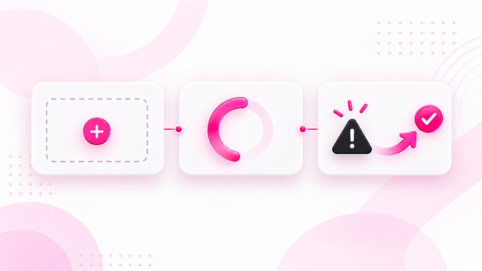
AI-generated conceptual illustration; not a product screenshot, measured result, or factual diagram.
A searchable library is not a single screen. It is a conversation that changes when someone arrives, waits, searches, loses a connection, and tries again. Designing only the populated grid leaves the most uncertain moments to improvised messages and accidental behavior.
The useful unit of interface state design is a transition: what the person was doing, what changed, what the interface can now truthfully show, and what they can do next. A beautiful empty illustration cannot fix a search that forgets its filters after an error.
This guide specifies a fictional resource library called Fieldnotes. Its visitors save design references and find them by keyword and format. The worked example covers an initial load, a genuinely empty library, a filtered search with no matches, a failed request, and recovery. The aim is a small specification a designer and developer can use together, rather than five disconnected mockups.
Start with facts the interface actually knows
Before drawing a state, list the information available to the screen. For Fieldnotes, that includes the current query, selected format, whether any successful response has arrived, the last successful result set, whether a request is pending, and whether the latest request failed.
Keep “we received zero results” separate from “we have not received results.” Both can produce an empty array in careless implementation, but they mean different things. The first supports a no-results message; the second supports a waiting or failure message. Neither tells you that the person's entire library is empty unless the response actually establishes that fact.
Also distinguish the library's total saved count from the number of matches. If someone has fourteen saved references but none match “ceramics” with the Video filter, the interface must not invite them to save their first reference. That message contradicts what they know and hides the real recovery action: changing the search.
Write these distinctions in ordinary language before turning them into component names. They expose missing product decisions much earlier than polished screen designs do.
Build a state inventory around one stable frame
Fieldnotes keeps its page heading, search field, format filter, and results area in a consistent arrangement. The contents of the results area change. The stable frame helps the person understand that they are still in the same library.
The initial loading view says “Loading your library.” It can reserve space for likely card shapes, but it does not show fabricated titles or a made-up result count. The controls remain understandable, and any unavailable action has an explicit reason.
The true empty view says “Your library is ready for its first reference.” Its primary action is “Save a reference,” with a short explanation of what can be saved. There is no retry button because nothing failed.
The filtered-empty view says “No references match ‘ceramics’ in Video.” It retains the search and filter values. Its primary action is “Clear filters,” with editing the query still available. The copy identifies the actual constraint instead of blaming the person for using the search incorrectly.
The failure view says “We couldn't load these results.” Its action is “Try again.” It preserves the query and filter. If previous results remain on screen, a separate message explains that they are from the last successful search.
Recovery returns to either results or an appropriate empty view. A successful retry is not automatically a populated state: the request might legitimately return no matches. That final distinction prevents recovery from becoming another untested edge case.
A compact state-to-action map
These are proposed Fieldnotes behaviors, not completed test results. Treat the retained search and the result provenance as part of each state.
| State and evidence | Show | Next action |
|---|---|---|
| Initial request pending | Loading your library; no count yet | Wait or edit the search; prevent stale responses from replacing newer ones |
| Successful empty library | First-reference invitation | Save a reference |
| Successful search with zero matches | Current query and format; no-matches explanation | Clear the format filter or edit/clear the query |
| First request failed | Failure message; attempted query retained | Try again with the same query and format |
| Refresh failed after success | Failure message and clearly marked previous results | Retry the attempted query and format |
| Retry succeeded | Results or the appropriate empty state | Continue from the actual response, including zero matches |
Define what clearing means: in this example, Clear filters removes the format filter only. It does not erase the query. If the query still yields no matches, the user can edit it or use a separately labeled Clear search action.
Write the transitions, not just the screen labels
Consider a visitor who searches for “poster” and gets six cards. They then choose Video, and the request fails. What should remain visible?
For this example, retain the six previous cards but label them as previous results. Do not silently present them as matching the new filter. Keep the selected Video filter visible, show the failure near the results heading, and let “Try again” request the same query-and-filter combination.
This is a design choice, not a universal requirement. In some interfaces stale information is dangerous or confusing enough that clearing it is preferable. Make the decision based on what the information is used for. A saved-reference library can tolerate clearly marked previous results; an availability check that drives a purchase needs much stronger protection against stale information.
Record the transition in a compact sentence: “When a refresh fails after an earlier success, retain previous cards with a stale-results label, preserve the attempted search, and offer retry.” That sentence is more actionable than a screenshot called Error 2.
Now cover the first-load failure separately. There are no earlier cards to retain, so the results area contains a failure explanation and retry action. Reusing the same message component is fine. Pretending the whole screen is identical is not.
Make loading behavior honest
A loading indicator should answer “Is anything happening?” without inventing information about how long it will take. Use a percentage only when the underlying process reports meaningful progress. A decorative percentage that drifts toward ninety-nine creates a promise the system cannot keep.
For Fieldnotes, initial loading uses a brief text label and neutral card placeholders. A later search keeps the search controls available and adds a smaller waiting message near the results count. This avoids repeatedly replacing the entire page for a local update.
Decide what happens if the person edits the query while a request is still in flight. The intended rule here is that only the response for the current search can update the visible results. If the “poster” response arrives after the later “ceramics” response, the older result must not take over the screen. Record that behavior in the handoff even if the implementation strategy belongs to the developer.
Also specify repeated activation. Pressing retry twice should not create two confusing streams of feedback. Either prevent an identical pending request from being started again or ensure duplicate requests cannot corrupt the final state. The user-facing behavior matters more than which internal technique achieves it.
Give every failure a proportionate recovery
“Something went wrong” is rarely enough, but a speculative explanation is worse. If the application cannot distinguish a connection problem from a server failure, say that results could not be loaded rather than claiming the person is offline.
A useful error message contains three parts: the affected task, whether existing work is safe, and a next step. Fieldnotes might say, “We couldn't load the new results. Your saved references haven't been changed. Try again.” Only include the preservation claim if the failure truly cannot have changed saved data.
Keep technical diagnostic details out of the primary message. If a support reference is available, make it easy to copy through a secondary disclosure. A raw stack trace does not help someone choose what to do next and can expose details that do not belong in the interface.
Not all failures deserve retry. An expired session needs a sign-in route; insufficient permission needs an explanation and an appropriate access route. Repeating a request cannot fix either condition. Map recovery to a known cause when the application has that information, and use a neutral retry path only when retry is plausibly useful.
Include the experience beyond the picture
Status changes need to work when a person is not looking directly at the changed area. W3C's guidance on status messages explains how qualifying updates can be exposed to assistive technology without moving focus. A result-count update and a waiting message are relevant examples; the entire results list is not itself the status message.
For Fieldnotes, keep a short status region separate from the card collection. Announce the completed result count or the failure concisely. Do not announce every placeholder, every card title, and every keystroke as a fresh alert. The design specification should identify the message worth hearing, not simply add “make accessible” at the bottom.
Keep focus in the search field while results update unless the user has initiated a navigation that warrants a different focus destination. After clearing filters, make the new state clear without unexpectedly moving the person to the beginning of the page. Test the actual implementation with keyboard navigation and a screen reader because static designs cannot verify announcement behavior.
Avoid using only color to distinguish failure, waiting, and success. Text labels and meaningful icons make the distinction clearer. If a spinner or shimmer animates, include a reduced-motion treatment in the component specification. The waiting state still needs to communicate its purpose when the animation is absent.
Turn the specification into a small test script
A useful test script makes each state reproducible. It should describe setup, action, expected message, expected retained information, and recovery. For this fictional library, use the following scenarios:
- Open a new account with no saved references. Confirm that the first-reference action appears only after a successful empty response.
- Delay the first response. Confirm that loading is visible and no false zero-result message flashes beforehand.
- Search an existing library for a query with no matches. Confirm that the query remains editable and the library is not described as empty.
- Apply a filter during a pending search. Return responses in the opposite order. Confirm that the current search wins.
- Fail the first request. Confirm that retry preserves the attempted query and does not require a page refresh.
- Fail a refresh after a successful search. Confirm that retained cards are clearly identified as previous results.
- Retry successfully with zero matches. Confirm that recovery reaches filtered-empty rather than an endless spinner.
- Navigate entirely by keyboard. Confirm that controls remain reachable and focus does not disappear during replacement.
Use deliberate fixtures or controlled responses to create these cases. Waiting for a real network failure is unreliable and makes it harder to compare revisions. Record observed results separately from the proposed behavior; an unchecked checklist is not evidence that the feature passes.
Decide what belongs in the shared component
Share structure where it genuinely repeats: message heading, explanation, optional action, and illustration slot. Keep the meaning of each state in the page-level specification. A universal component cannot know whether “Clear filters,” “Save a reference,” or “Sign in” is the correct recovery.
Likewise, do not force every state to have the same visual weight. A first-use empty page may benefit from a larger explanation. A temporary refresh failure inside an otherwise usable library should usually be more restrained. Consistency means recognizable relationships and predictable behavior, not identical amounts of decoration.
The finished system should include the state inventory, transition rules, approved message copy, control behavior, and reproducible test scenarios. Together they explain what the product does when reality interrupts the ideal screenshot. That is the real deliverable: a library that stays understandable even before there is anything useful to display.