A Winning Creative Business Proposal Template Guide
By Steven Van ·
Use our creative business proposal template to craft proposals that win clients. This guide shares proven strategies for design, copy, and pricing.
A good creative business proposal is your best shot at turning a promising conversation into a signed contract. It’s more than just a quote; it’s a strategic document that shows a potential client you truly understand their problem and have the perfect solution. This guide will give you a downloadable template and walk you through how to build proposals that actually get you hired.
Your Blueprint for Winning Creative Proposals
We’ve all been there: staring at a blank page, trying to figure out how to start a proposal from scratch. It’s a huge time-suck and a total creative drain. You end up spending more energy on formatting and structure than on the actual ideas that will win you the job.
This is exactly why a solid proposal template is a creative’s best friend. Think of it as a pre-built framework that frees you up to do what you do best: come up with amazing ideas. Instead of reinventing the wheel every time, you can jump straight into showing the client your vision and explaining why your approach is the right one. That shift from admin headaches to strategic thinking is what separates a proposal that gets ignored from one that gets a "yes."
Anatomy of a Winning Creative Proposal
A winning proposal is all about telling a clear, compelling story. It walks the client from their current problem to your proposed solution, making it incredibly easy for them to see the value you bring.
Here’s a breakdown of the essential sections every creative proposal should have. Think of these as the chapters in your story.
| Section | Purpose | Key Content to Include |
|---|---|---|
| Cover Letter & Title Page | Make a strong first impression. | Personalized greeting, project title, your branding, and the client's name. |
| Problem/Client Needs | Show you've been listening. | A summary of the client's challenges, goals, and desired outcomes in their own words. |
| Proposed Solution | This is where you shine. | Your unique creative approach, strategy, and why it's the best fit for their needs. |
| Scope of Work & Deliverables | Set crystal-clear expectations. | A detailed list of what you will (and won't) be delivering. Be specific! |
| Timeline & Milestones | Prove you have a plan. | A clear project schedule with key dates for reviews, feedback, and final delivery. |
| Pricing & Investment | Present your value, not just a price. | A clear breakdown of costs. Offering 2-3 pricing tiers can be very effective. |
| Call to Action (CTA) | Tell them what to do next. | Simple, direct instructions on how to approve the proposal and kick things off. |
Each of these elements builds on the last, creating a powerful argument for why you are the right choice for the project.
A great proposal doesn’t just sell your services; it sells a partnership. It should feel less like a transactional document and more like the beginning of a successful collaboration.
When you start with a proven structure, you ensure every proposal you send out is professional, thorough, and persuasive. If you work in a specific field like graphic design, using a template built for that niche can give you an even bigger edge. For a deeper dive, check out our guide on creating a compelling graphic design proposal template.
Designing a Proposal That Stands Out
As creatives, our proposals are our first handshake. Long before a potential client reads a single word about our strategy or pricing, they’re forming an opinion based on the design of the document itself. That initial impression is powerful—it can instantly position you as a top-tier professional or just another name in their inbox.
A well-designed proposal does more than just look pretty. It’s a strategic tool. It guides the client’s eye, highlights the most important information, and makes complicated details feel simple. Think of it as your opening argument, delivered through design.
Balancing Brand Identity With Readability
The trick is to make sure your proposal looks and feels like it came from you. It should reflect your brand’s personality, whether that's minimalist and modern or bold and vibrant. But here's the catch: that creativity can never get in the way of clarity. At the end of the day, a busy client needs to be able to scan it quickly.
Here’s how to strike that perfect balance:
Strategic Use of Whitespace: Don't cram everything onto the page. Whitespace isn’t empty space; it’s a design tool that gives your content room to breathe. It creates a more premium, less intimidating feel and helps draw the eye to key sections, like your pricing table.
Thoughtful Typography: Keep it simple. Stick to two, maybe three, complementary fonts at most. Use one for your headings and another for the body text to build a clear visual hierarchy. Make sure your body copy is easy to read (usually 11-12 points) and give it generous line spacing.
A Cohesive Color Palette: Use your brand colors, but with intention. A splash of color is perfect for highlighting headings, key stats, or your call to action. Using too many colors, however, will just look chaotic and unprofessional.
To make sure you nail that first impression, starting with a clear proposal letter format can make all the difference. It helps set a professional tone right from the very first page.
Incorporating Visuals for Maximum Impact
Let's be honest: walls of text are boring and forgettable. As a creative, you have a huge advantage here—you can show your value instead of just talking about it. The most successful proposals lean heavily on visuals to get the point across quickly and effectively.
This infographic breaks down which parts of a proposal tend to have the biggest influence on a client's decision. These are the exact spots where strong design can give you an edge.
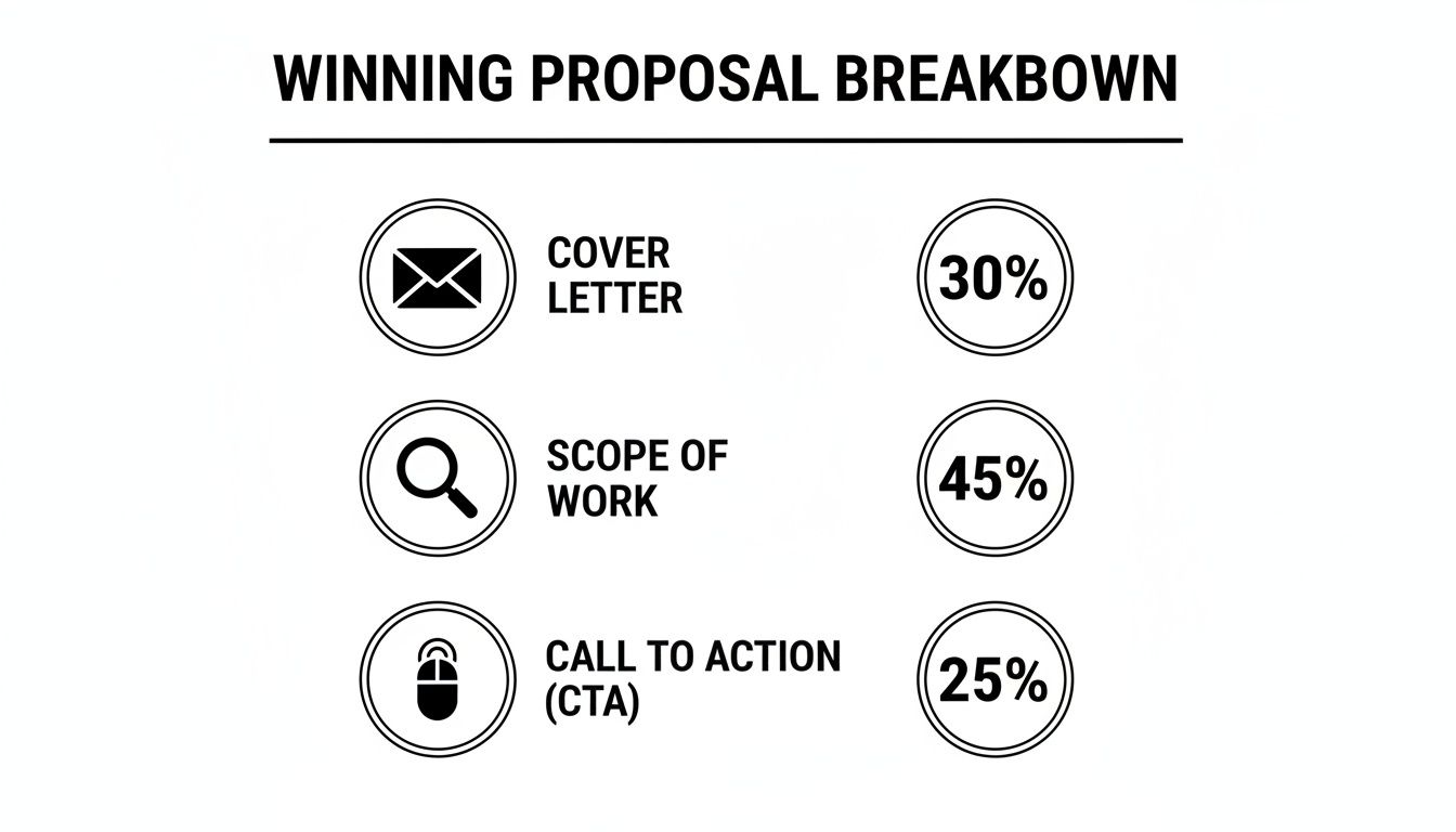
As you can see, a strong cover letter, a well-defined scope, and a clear call-to-action are critical. Thoughtful design makes every single one of those sections more powerful.
A well-placed image or chart can often communicate more in three seconds than three paragraphs of text. Use visuals to break up text, illustrate your points, and make your proposal more engaging.
High-resolution images from your portfolio are non-negotiable. Don't just list your past projects; embed stunning visuals directly into your case studies or solutions sections. It's concrete proof of what you can do and helps the client visualize the amazing work you're going to do for them.
Creating a Clear Visual Hierarchy
When a client opens your proposal, their eyes should naturally land on the most important information first. You achieve this with a strong visual hierarchy. Use headings, subheadings, bold text, and bullet points to create a logical and scannable structure.
For example, your main section titles should be the largest and boldest text on the page. Subheadings should be smaller but still stand out from the regular body copy. This simple structure allows a client to skim the document and get the gist, even if they don't read every single word.
Data shows that the sweet spot for most creative proposals is between 5 to 10 pages—long enough to be thorough, but short enough to be read. In fact, proposals that use clear headings and charts to visualize metrics convert 52% better. And according to a deep dive from Bidsketch, winning proposals include 20-30% more visuals, which can slash the client's review time by a staggering 40%.
Writing Persuasive Copy for Each Section
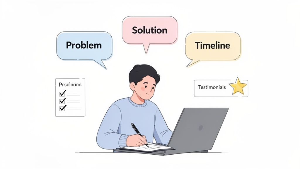
A great-looking proposal gets you in the door, but the words inside are what actually close the business. This is where you build a story that walks your potential client from the challenge they’re facing right to your solution, making a "yes" the only logical conclusion.
Every word has a job to do. You need to show the client you understand their problem so clearly that they feel seen. Once you’ve done that, you can introduce your services not just as a deliverable, but as the exact answer they’ve been searching for.
Crafting a Compelling Introduction
The first few sentences are your opening handshake. Ditch the generic "Thank you for the opportunity..." and cut straight to the chase. Start by referencing a specific detail from your first conversation to prove you were paying attention.
This simple act makes the proposal feel custom-built, not like a template you fire off to everyone. Frame the project in a way that gets them excited and connects your work to their bigger business goals.
Bad Example: "This proposal outlines our services for your branding project."
Good Example: "We're excited by the opportunity to help [Client's Company] redefine its brand identity to capture a younger audience and drive market share in the competitive e-commerce space. This proposal details our strategic approach to make that vision a reality."
See the difference? It immediately shifts the focus from what you do to what they get.
Articulating the Client's Problem with Empathy
This might be the single most important part of your entire proposal. Before you can offer a solution, you have to prove you genuinely understand the problem. Your goal is to sound less like a salesperson and more like a trusted consultant.
A powerful technique is to use the exact language the client used during your discovery call. This mirroring builds an instant, subconscious layer of trust. Structure this section to show the real-world business impact of their challenges.
- State the surface problem: "Your current website isn't mobile-friendly and feels outdated."
- Explain the business consequence: "This leads to a high bounce rate on mobile devices, losing an estimated 40% of potential leads who visit your site."
- Touch on the emotional impact: "This disconnect creates brand friction and makes it difficult to compete with newer, more agile competitors."
By framing the problem this way, you’re not just selling a website redesign. You’re selling a solution to lost revenue, a fractured brand experience, and a competitive disadvantage. You’re selling peace of mind.
This deep understanding is what separates a generic pitch from a true strategic partnership. To learn how to pull this information out of clients effectively, check out our guide on building a better creative brief template.
Presenting Your Solution with Confidence
You've set the stage by defining the problem. Now, it's time to present your solution. The key is to connect every single thing you do back to a specific benefit for the client. They don’t care about the software you use; they care about the results you can get them.
Don't just list deliverables. Frame them as outcomes. A simple "Our Action -> Your Outcome" structure makes your value proposition impossible to miss.
| Our Action (Feature) | Your Outcome (Benefit) |
|---|---|
| New Brand Identity System | A consistent and professional look across all platforms that builds trust and recognition. |
| Mobile-First Website Design | A seamless user experience on any device, capturing more leads and boosting conversions. |
| Custom Photography & Video | Authentic, high-quality assets that tell your unique story and set you apart from stock-photo competitors. |
This approach keeps the conversation focused on their return on investment. It proves you're not just another vendor but a partner who is genuinely invested in their growth.
Weaving in Social Proof for Credibility
Your words are good, but proof is better. Don't save all your testimonials for the end of the proposal. You should sprinkle in social proof throughout the document where it feels most relevant to build credibility and make the client feel safe.
Instead of a generic case study page, integrate mini-examples directly into your solution sections.
Example: "Our proposed content strategy is similar to the one we developed for Company X. By focusing on targeted, value-driven blog posts, we helped them increase their organic search traffic by 120% in just six months."
Then, you can immediately follow it with a quote from that client:
"Working with [Your Company] was a game-changer. They didn't just write articles; they built a content engine that continues to deliver qualified leads month after month." - CEO, Company X
This tactic is incredibly persuasive. It lets your past successes do the heavy lifting, showing the client that the results you're promising are not just possible—they're proven.
Interestingly, an analysis of over 25,000 proposals by Bidsketch.com found that winning proposals were 21% shorter on average. This proves that concise, powerful copy packed with proof is what wins the job.
Pricing Your Services and Defining Project Scope
Let's get into the part of the proposal that often causes the most stress: the money and the deliverables. A brilliant creative idea means nothing if the pricing is a mess or the scope of work is vague.
Getting this section right is about more than just getting paid. It’s about building trust, managing expectations, and protecting yourself from the dreaded scope creep. Approaching this with confidence and absolute clarity is a game-changer for your client relationships.
Finding the Right Pricing Structure
There isn't a one-size-fits-all answer for pricing creative work. The best model really depends on the project's complexity, your history with the client, and what makes sense for your own business.
Project-Based Fees: This is often the cleanest approach. You quote a single, flat fee for the entire project. It works beautifully when you have a crystal-clear scope and can accurately estimate your time. Clients love the predictability.
Hourly Rates: Charging by the hour is great for projects with moving parts or for ongoing retainers. The risk? It can make clients hyper-focused on the clock and inadvertently punishes you for being efficient. The faster and better you get, the less you earn for the same task.
Value-Based Pricing: This is the expert-level move. Instead of tying your fee to your time, you tie it to the tangible value you're creating for the client's business. If your rebrand is projected to boost their revenue by $100,000, your fee is a percentage of that impact. This model requires a ton of trust and a rock-solid business case to back it up.
A lot of creatives, myself included, often land on a hybrid model. You might charge a flat project fee for the core work and have an hourly rate for anything that falls outside that initial agreement.
How to Present Your Pricing in Tiers
One of the most powerful strategies you can use is tiered pricing. Don't just give the client one number to approve or deny. Give them options.
This simple psychological shift changes the conversation from "Is this worth it?" to "Which option is the best fit for us?" It immediately positions you as a flexible partner. Plus, the highest tier helps anchor the value, making your middle package—often the one you'd prefer they choose—look like the most reasonable choice.
Here’s a simple structure you can easily adapt:
| Package Tier | Best For | Key Inclusions |
|---|---|---|
| Essential | Startups or clients needing core assets on a tighter budget. | Logo Design, Basic Brand Style Guide, 2 Rounds of Revisions. |
| Growth (Most Popular) | Businesses ready to make a significant impact on their brand. | Everything in Essential, plus a Social Media Kit, Business Card Design, and 3 Rounds of Revisions. |
| Premium | Companies investing in a complete, top-to-bottom brand transformation. | Everything in Growth, plus a 10-page Website Design, Custom Illustrations, and Priority Support. |
A pricing table gives the client a sense of control and makes them an active participant in the decision. It’s a small detail that goes a long way in building trust from the jump.
Defining a Bulletproof Scope of Work
If the pricing section is what it costs, the scope of work is what they actually get. This is your single best defense against scope creep—those endless "small requests" that derail your timeline and destroy your profit margins.
Your scope of work needs to be surgically precise. Leave no room for assumptions.
What to Include:
Deliverables: List every single thing the client will receive at the end of the project. Be specific. Don't just say "Social Media Graphics." Instead, write "10 static Instagram feed graphics (1080x1080px) and 5 animated Instagram Story graphics (1080x1920px), delivered as final JPG and MP4 files."
Revision Rounds: State exactly how many rounds of revisions are included. Two or three is a common industry standard. Make sure to specify that any additional rounds will be billed separately at your hourly rate.
Exclusions (What's Not Included): This part is just as crucial as what is included. Clearly state what you are not responsible for. Good examples are: "This project scope does not include copywriting," "Licensing fees for stock photography are not included," or "Website hosting and domain registration will be the client's responsibility."
Being incredibly upfront here sets firm boundaries from the start. It ensures everyone is on the same page and avoids awkward conversations down the line. Think of this section as your project's safety net—make it a strong one.
Customizing Your Template for Maximum Impact
Think of your proposal template as the starting blocks, not the finish line. Simply filling in the blanks is a huge missed opportunity. The real power comes from using that solid framework to build something that speaks directly to each client.
When you personalize a proposal, you’re showing you’ve done your homework. It immediately tells the client you’ve taken the time to understand their specific problems and what they hope to achieve. Shifting from a generic pitch to a tailored solution is what truly moves the needle and lands you more work.
And this isn't just a gut feeling—the numbers back it up. With proposal tools like PandaDoc offering hundreds of templates, standing out is more important than ever. One analysis of 25,000 proposals found that customized, modern designs see a 29% higher close rate. That's a massive advantage.
Tailoring Language and Visuals
The quickest way to build rapport is to speak the client's language. Before you type a single word of your proposal, spend ten minutes on their website and social media. Get a feel for their brand voice. Are they buttoned-up and corporate, or are they laid-back and conversational?
Mirroring their tone makes your proposal feel like a natural fit from the first sentence. If you're pitching a law firm, your language should be professional and precise. But if your prospect is a new D2C skateboard brand, you can lean into a more relaxed, edgy voice.
This same logic applies to your visuals. A simple but effective trick is to adjust your template’s color palette to reflect the client’s brand colors. It's a subtle change that subconsciously tells them, "We already get you."
Pitching a tech startup? Your proposal should feel clean, modern, and data-focused. Think sleek fonts, plenty of white space, and maybe even a chart that visualizes the potential ROI of your work.
Pitching a wedding planner? Go for a romantic, elegant feel. Use beautiful serif fonts, showcase high-resolution photos from past events, and stick to a softer color scheme.
Swapping Out Case Studies and Examples
Nothing screams "one-size-fits-all" louder than irrelevant case studies. Your proposal template should have a dedicated spot for portfolio examples that you swap out for every single pitch. The key is to choose work that resonates directly with the potential client.
If you’re pitching a restaurant, you should absolutely feature the work you did for another client in the food and beverage industry. Be sure to highlight the results that a restaurant owner actually cares about, like a jump in online reservations or more foot traffic from a targeted social campaign.
Your goal is to make the client think, "They've solved this exact problem before. They can do it for me, too." This targeted proof is far more powerful than showing off your most creative project if it has no relevance to their business.
Don't have a perfect 1:1 match? No problem. Select a case study that demonstrates a similar strategic approach. Then, explicitly walk them through how your process on that project would apply to their unique situation. This showcases your strategic mind, not just the finished product. For more project ideas, you can explore some of the most popular templates and resources used by other creatives.
Adding a Personal Touch
In a crowded market, going that extra mile is often what seals the deal. Modern digital proposal software makes it incredibly easy to add a personal element that helps you stand out.
Try embedding a short, personal intro video at the start of your proposal. A simple 60-second clip where you greet the client by name and express your genuine excitement for the project is incredibly powerful. It puts a face to a name and builds an immediate human connection.
Even when responding to a formal Request for Proposal (RFP), where the structure is more rigid, personalization still counts. If you need a starting point, downloading an essential RFP template can help you cover all your bases quickly. From there, customizing it with the client’s branding and targeted case studies will make your response feel anything but generic.
Common Questions About Creative Proposals
Even with a killer template, you're bound to have a few lingering questions before you hit 'send'. Getting those questions answered is what separates a hesitant pitch from a confident one.
Let's walk through some of the most common questions I hear from other creatives when they're putting proposals together.
How Long Should My Creative Business Proposal Be?
For most creative projects, the sweet spot is somewhere between 5 to 10 pages. This gives you enough room to lay out your solution, define the scope, and present your pricing without sending your client a novel.
Of course, this isn't a hard and fast rule. If you're working on a smaller project or pitching someone you've worked with before, a punchy 2-4 page proposal can do the trick. On the flip side, a massive, multi-faceted project might need a bit more space to breathe.
The most important thing to remember is that clarity always wins over length. The data consistently shows that winning proposals are actually more concise. Focus on getting your message across clearly and powerfully, not on hitting an arbitrary page count.
What Is the Most Important Section of a Business Proposal?
Every part of your proposal plays a role, but if you want to know where the client's decision really gets made, it's in the "Proposed Solution" and "Pricing" sections. These two carry the most weight.
Think of the "Proposed Solution" as your chance to prove you were really listening. It’s where you show you get their problem inside and out and present a bespoke plan to fix it. This is where you sell your vision.
Right after that, the "Pricing" section needs to be crystal clear and directly connected to the value you just outlined. This is the final gut-check for the client and where they decide if the investment makes sense.
Should I Send My Proposal as a PDF or an Interactive Link?
In 2026, an interactive, web-based proposal link is the way to go. A well-designed PDF still looks professional, sure, but it's a static document. It can't compete with the engagement and intelligence you get from modern proposal software.
I'm a big fan of platforms like PandaDoc or Proposify, and for good reason:
- Engagement: You can actually embed things like an intro video of yourself or a portfolio carousel right in the proposal. It brings your work to life.
- Interaction: My favorite feature. Clients can select from different pricing tiers or packages, and the total updates in real-time.
- Analytics: This is the real secret weapon. You get a notification the moment a client opens your proposal. You can see how many times they've viewed it and which pages they're spending the most time on.
That data is gold for your follow-up. Knowing they spent ten minutes looking at your pricing page tells you exactly what to talk about when you check in.
How Soon Should I Follow Up After Sending a Proposal?
I’ve found that following up within 2-3 business days is the perfect cadence. It shows you're on top of things and genuinely interested, but it doesn't feel desperate or pushy.
Your first follow-up can be super simple. Just a quick email to make sure they got it and to see if any initial questions popped up. It's a low-pressure way to get a conversation started.
And if you're using a tool with analytics, you can time your follow-up perfectly. Sending a quick note just after you see they’ve finished reviewing it for the second time? That's a pro move.
Ready to stop building proposals from scratch? Creators Toolbox provides you with the tools, templates, and insights to win more creative work. Get started today at creatorstoolbox.com.