Choose a Spacing System and Test It on a Real Layout
By Steven Van ·
Choose spacing tokens by testing a real settings page, with field and section rules, responsive adjustments, long-content checks, and documented exceptions.
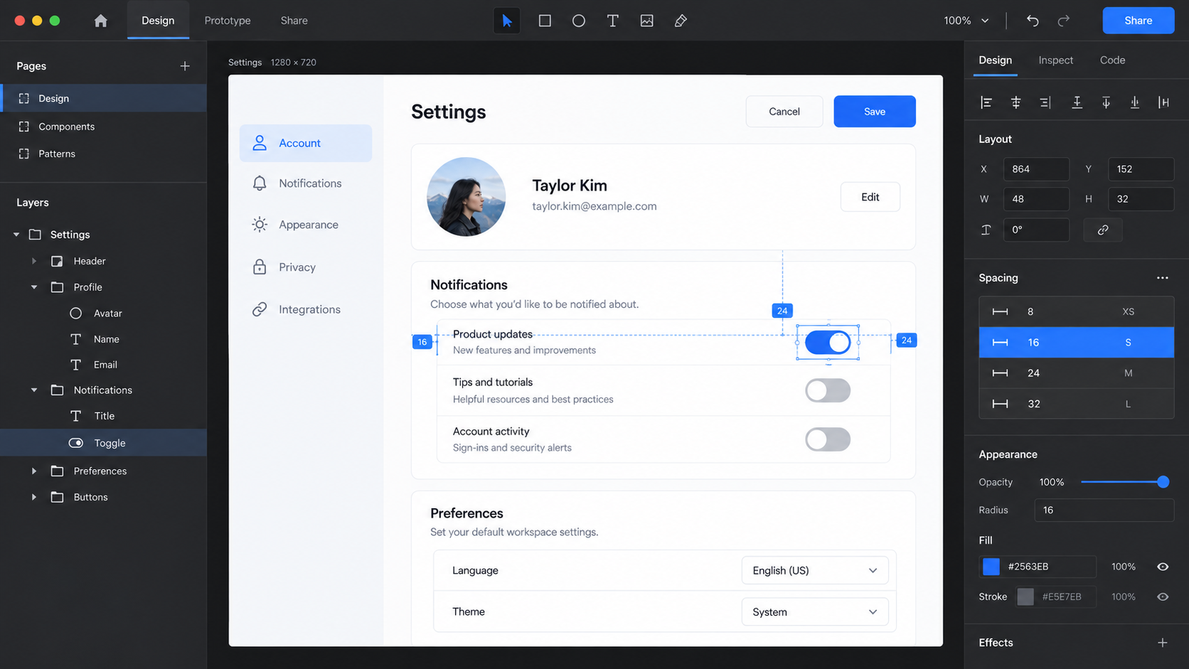
AI-generated conceptual illustration; not a product screenshot, measured result, or factual diagram.
A spacing system is useful when it helps you explain why two things belong together and why another thing belongs elsewhere. A list of numbers alone cannot do that. You can make every gap a multiple of four and still produce a settings page where labels seem attached to the wrong controls.
The practical task is to choose a small set of distances, assign them clear jobs, and test those jobs against real content. This guide refactors a fictional creator account page with profile details, notification preferences, a plan summary, and a destructive account action. The starting values and revised values are illustrative design choices, not results from a usability study.
By the end, you should have a spacing scale, a mapping from values to relationships, an exception policy, and a set of stress tests. You do not need to redesign an entire brand or learn a new design application first.
Audit the page before choosing the scale
Start with the page as it exists. Measure repeated relationships rather than every visible distance. For the fictional page, the audit finds label-to-control gaps of 5, 8, and 11 pixels; field-to-field gaps of 14, 19, and 24 pixels; and section separations ranging from 20 to 44 pixels.
The problem is not merely that there are many numbers. The relationship between them is inconsistent. One helper message sits farther from its input than the next field label does, making the helper feel detached. The account deletion panel sits as close to notification preferences as two ordinary fields sit to each other.
Make a short inventory of relationship types: label to input, input to helper, one field to the next, heading to section content, one section to the next, and content to container edge. Add action groups if the page contains several buttons.
Also note distances that are not interchangeable with spacing tokens. A control's minimum height, a focus indicator's offset, and the visual correction needed to center an icon may need separate decisions. Mixing all of them into one scale makes the system harder to reason about.
Choose a small scale that fits the actual page
For this example, start with 4, 8, 12, 16, 24, 32, and 48 pixels. The smaller increments help within controls and closely related text; the larger steps create grouping between fields and sections. This is a candidate scale, not an industry law.
A different product may need denser controls or more generous editorial layouts. Choose values that support its content and interaction style. Do not select an eight-point grid simply because a popular design system uses one, then add six exceptions to make your own page work.
Give the raw values neutral names, such as space-1 through space-7, or names that expose the value. Then define semantic uses where they improve clarity: field-gap, section-gap, and panel-padding. The first layer answers “what values exist?” The second answers “what does this relationship need?”
Avoid naming a token after its current location, such as profile-left-margin, unless that genuinely represents a component-specific rule. A semantic relationship can survive a layout change; a coordinate-based name often becomes misleading when the interface stacks on a narrow screen.
Assign each relationship a default
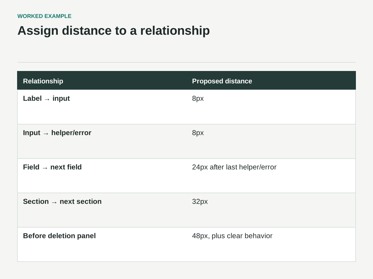
The proposed settings page uses an 8-pixel label-to-input gap, an 8-pixel input-to-helper gap, 24 pixels between fields, 16 pixels between a section heading and its content, 32 pixels between ordinary sections, and 48 pixels before the destructive-action section.
These choices express a hierarchy: pieces within one field are closer than separate fields; fields within one section are closer than separate sections; the destructive action receives additional separation because its purpose differs from routine settings.
The 48-pixel separation does not make account deletion safe by itself. Wording, confirmation behavior, and the action's implementation still matter. Spacing simply helps the page communicate that the action belongs to a different category.
Put these defaults in a small relationship specification. Include a real example beside each one. “Field gap: distance from the last visible helper or error message to the next field label” is more precise than “24 pixels between inputs,” which leaves ambiguous what happens when supporting text appears.
Before-and-after relationship sheet
Read each gap from the last visible item in one group to the next group. The values are proposed pixels for this example, not universal accessibility requirements.
| Relationship | Before | Proposed rule |
|---|---|---|
| Label → input | 5, 8 or 11px | 8px within the field |
| Input → helper or error | Inconsistent and sometimes detached | 8px within the same field |
| Field → next field | 14, 19 or 24px | 24px after the last helper/error |
| Section → next section | 20–44px | 32px |
| Routine settings → deletion panel | Insufficient differentiation | 48px plus clear wording and appropriate confirmation |
| Panel edge → content | One rigid setting | 32px wide layout; 16px narrow layout |
When helper text is absent, omit that element rather than leaving an empty spacer. If both helper and error are present, decide their order and keep both inside the field group.
Refactor one section before the whole page
Use the profile section as a pilot. It contains display name, portfolio URL, and a short biography. Keep the existing type sizes and control styles initially so you can see what the spacing change contributes.
First, group each label, control, and helper message as one field. Apply the close internal gaps there. Then place those field groups in a parent stack with the larger field gap. This makes the relationship explicit in the layout structure rather than relying on unrelated margins attached to individual children.
For a web implementation, gap can define spacing between items in grid and flex layouts. It does not replace the padding inside a container; the distinction is documented in MDN's gap reference. Keep outer panel padding and inner stack spacing as separate decisions so changing one does not unexpectedly alter the other.
Inspect the pilot without measurement overlays. Can you tell which helper belongs to which input? Is the biography field obviously part of the profile section? If the answer is no, adjusting token values may not be enough. You may need a clearer heading, shorter helper copy, or a different arrangement.
Test the content that breaks the tidy version
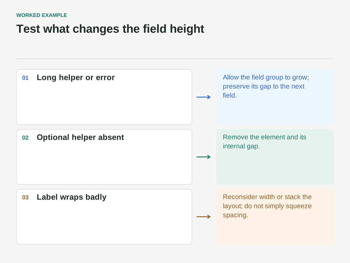
Replace the short biography helper with two sentences. Add a validation message below the portfolio URL. Use a long display name and a translated label that wraps to two lines. These are useful fixtures because they change the height of the field without changing its relationship to neighboring fields.
The intended behavior is simple: supporting text expands within its field group, and the gap to the next field remains consistent. The page should not require a special margin override every time a message appears.
Also test missing content. If an optional helper is absent, the layout should not leave behind its empty gap. If a section contains only one field, it should still look like a section rather than an orphaned control floating in a large card.
Do not solve every wrapping problem by reducing spacing. A label that becomes unreadable in a narrow column needs more width or a stacked layout. Shrinking the gaps may make the panel look compact while leaving the underlying content problem intact.
Separate density from responsiveness
A narrow screen does not automatically require denser controls. It often needs fewer columns and more vertical space because text wraps. Treat density as a deliberate product mode and responsiveness as the arrangement's response to available space.
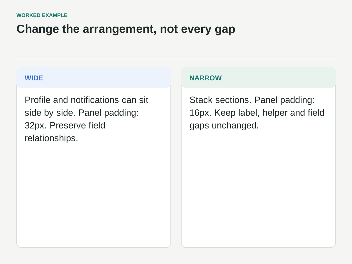
For the fictional page, wide layouts can place profile and notification sections beside one another. Narrow layouts stack them and reduce outer panel padding from 32 to 16 pixels. The label, helper, and field relationships remain unchanged.
That gives the interface more usable content width without compressing the relationships people rely on to read a form. If the page still overflows, inspect fixed widths, long unbroken strings, and button groups before cutting every gap in half.
W3C's reflow guidance explains the accessibility expectation for content to fit narrow equivalent widths without requiring two-dimensional scrolling, with defined exceptions. Use that guidance as a test reference, then inspect the actual page under zoom and at narrow widths. A spacing scale cannot establish conformance on its own.
Keep targets and spacing distinct
An icon may occupy a small visual area while its interactive target is larger. Conversely, two generously separated tiny icons can still be difficult to activate. Measure the clickable region, not just the drawing.
WCAG 2.2's Target Size (Minimum) criterion addresses target dimensions and includes spacing-based and other exceptions. Its baseline is 24 by 24 CSS pixels, subject to those exceptions. It is not a recommendation that every control should be made as small as that baseline.
For the settings page, choose control sizes appropriate to the task and input methods, then use spacing to separate the controls clearly. Do not count decorative padding around a non-clickable wrapper as part of the active target unless the implementation actually makes that region interactive.
This distinction matters for notification toggles. A row can look spacious while only a tiny switch responds. Review the label behavior and activation region with the implementation, rather than judging the screenshot alone.
Create an exception policy before exceptions spread
Some exceptions are legitimate. An icon may need a small optical adjustment to appear centered. A dense data widget may need a compact internal rhythm. A branded illustration may align better with nearby text when its visible edge differs from its file boundary.
For each exception, record the reason, scope, and owner. “Move this icon one pixel to compensate for asymmetric artwork” is bounded. “Use 19 pixels because it looked better” is not a reusable explanation.
Do not add a new global token every time one component needs a correction. That makes the scale look systematic while quietly restoring arbitrary values. Prefer a documented component-level exception when the need is truly local.
Revisit an exception if it appears repeatedly. Three unrelated components asking for the same relationship may reveal a missing token. Three overrides fixing the same misaligned icon may instead reveal an asset problem. The count alone does not tell you which explanation is right.
Review the whole page with specific questions
After refactoring the remaining sections, look at the page in both its ordinary and stressed forms. Review one relationship at a time rather than scanning for a vague impression of polish.
- Are labels visibly closer to their own controls than to neighboring fields?
- Do helpers and errors remain inside the field they explain?
- Are section gaps distinguishable from field gaps?
- Do panel edges provide enough room without stealing necessary content width?
- Does the layout still make sense with a one-line section and a much taller neighboring section?
- Can buttons wrap or stack without losing their order and relationship?
- Do zoom, long labels, and validation messages expose hidden fixed-height assumptions?
- Are exceptions documented and genuinely local?
If you can run a short usability session, ask people to find and change specific settings rather than asking whether the spacing looks good. Their navigation and interpretation are more useful than aesthetic agreement. Keep those findings separate from your initial design hypothesis.
Ship the rules with the page
The final deliverable should contain the token values, semantic relationship mapping, before-and-after examples, responsive adjustments, and known exceptions. Include at least one screenshot with long labels and errors visible. The tidy default page is insufficient documentation for a system intended to survive real content.
When someone proposes a new spacing value later, ask what relationship the existing values cannot express. That question keeps the conversation focused on the interface instead of personal preference. Sometimes the new value is justified; sometimes the layout structure needs repair.
A good spacing system reduces the number of decisions you repeat while preserving the decisions that matter. Its success is not measured by how few numbers appear in the file, but by whether the page remains readable, adaptable, and easy to maintain when its content changes.