Build a Responsive Card Grid Around Content Constraints
By Steven Van ·
Derive a responsive card grid from content width, then test sparse counts, long titles, image crops, keyboard order, and narrow-container edge cases.
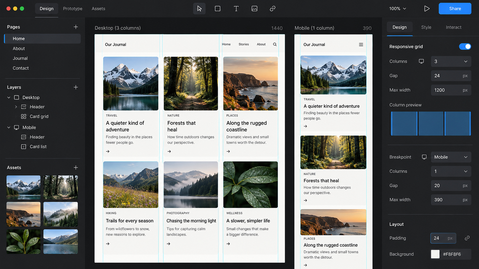
AI-generated conceptual illustration; not a product screenshot, measured result, or factual diagram.
A responsive card grid should change columns when its content needs room, not merely when the viewport crosses a familiar device width. If a card's title, image, and controls become awkward at 260 pixels, choosing a tablet breakpoint by habit will not solve the problem.
Start with the smallest useful card. Then let the grid decide how many of those cards fit inside the available container. This guide uses a fictional library of downloadable workshop templates. Each card includes a preview image, a title, a format label, a short description, and a download link.
The worked dimensions below are design hypotheses for that library. They are not universal card standards or the result of an unreported usability test. The method is to derive a starting point, build it, and deliberately test the content most likely to break it.
Define the card's job before its shape
The workshop card needs to help someone identify the template, understand its format, and open the right download. That gives the information a clear order: title first in meaning, preview as supporting evidence, format as a useful qualifier, and action after enough context to choose.
Do not include a date, author, rating, badge, and menu simply because other cards have them. Every extra element creates another width and height constraint. Add it only if it changes the person's decision or supports a required action.
For the sample library, use three representative titles: “Workshop agenda,” “A planning sheet for a two-day community print workshop,” and “Large-print participant feedback form.” The second tests wrapping; the third tests whether an important qualifier survives the layout.
Also create a card with no optional description, one with a long description, and one with a missing preview. A component built only around the shortest title and a perfect image has not yet been designed for the library.
Derive a minimum width from the awkward card
Place the long-title card in a resizable container. Begin wide enough that everything reads comfortably, then reduce the width. Watch for the point where the title becomes a narrow column, the format label wraps unnecessarily, or the action loses its relationship to the description.
Suppose the example card remains workable at an outer width of 288 pixels, including 20 pixels of padding on each side. That leaves 248 pixels for text. Use 288 as the initial minimum card width, then verify it with the actual font and content.
The number is not derived from a character-count formula alone. Font metrics, word lengths, language, button labels, and the surrounding layout all affect the result. Measuring a real specimen is more useful than assuming that every card should fit a standard width.
Write down what would make the minimum change. A new secondary action, larger default type, or longer translated labels may require more room. The minimum is a content constraint maintained by the component, not an eternal constant chosen once during a redesign.
Calculate the container thresholds
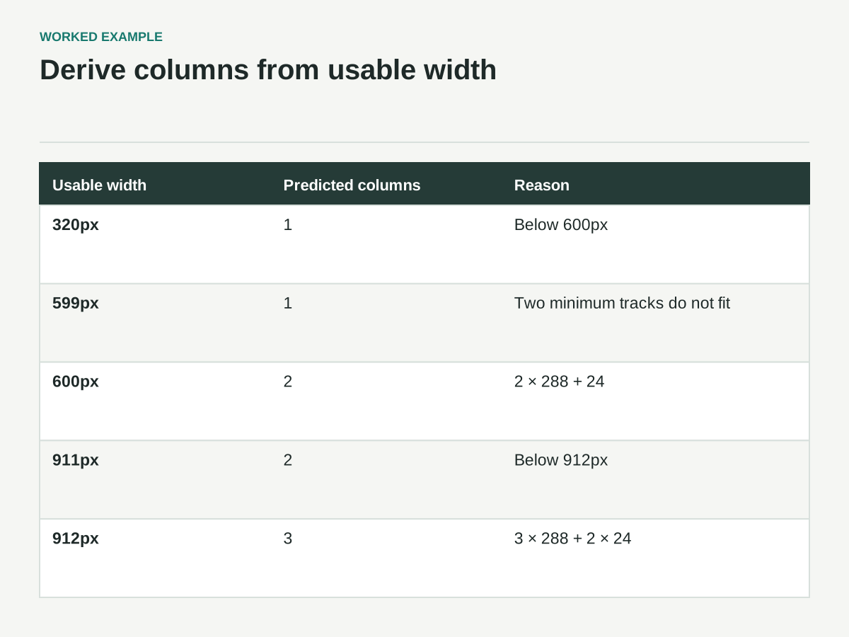
Once the minimum width and gap are known, the approximate thresholds are straightforward. With 288-pixel cards and a 24-pixel gap, two columns need 600 pixels of usable container width: two cards plus one gap. Three need 912 pixels: three cards plus two gaps.
These are container widths, not viewport widths. If the page has 24 pixels of padding on each side, a 600-pixel grid needs a wider viewport. If the grid sits beside a sidebar, the difference is larger. This is why a card layout can fail inside a dashboard even when it looked correct on a full-width demo page.
Set an overall maximum width if very wide cards or an excessive number of columns would weaken the reading experience. For the sample library, a three-column maximum may be appropriate for the available content, but that is an editorial and layout decision to test rather than a technical requirement.
Check the threshold neighborhoods, not only the exact values. A layout at 599, 600, and 601 pixels can reveal overflow or rounding assumptions that are invisible in a single large screenshot.
Let CSS express the relationship
CSS Grid can create repeated tracks and distribute available space. MDN's basic grid guide explains the grid container, tracks, and fractional units. For the sample layout, the central idea is a repeated track with a content-informed minimum and a flexible maximum.
A practical starting declaration is grid-template-columns: repeat(auto-fit, minmax(min(100%, 18rem), 1fr)), paired with display: grid and an appropriate gap. At a 16-pixel root font size, 18rem corresponds to the example's 288 pixels; using rem lets the constraint follow the root size rather than assuming that conversion is permanent.
The inner min(100%, 18rem) prevents the track minimum from demanding more than the container's width when the container is narrower than the preferred card minimum. This does not fix every overflow source inside the card, but it avoids one common grid-level problem.
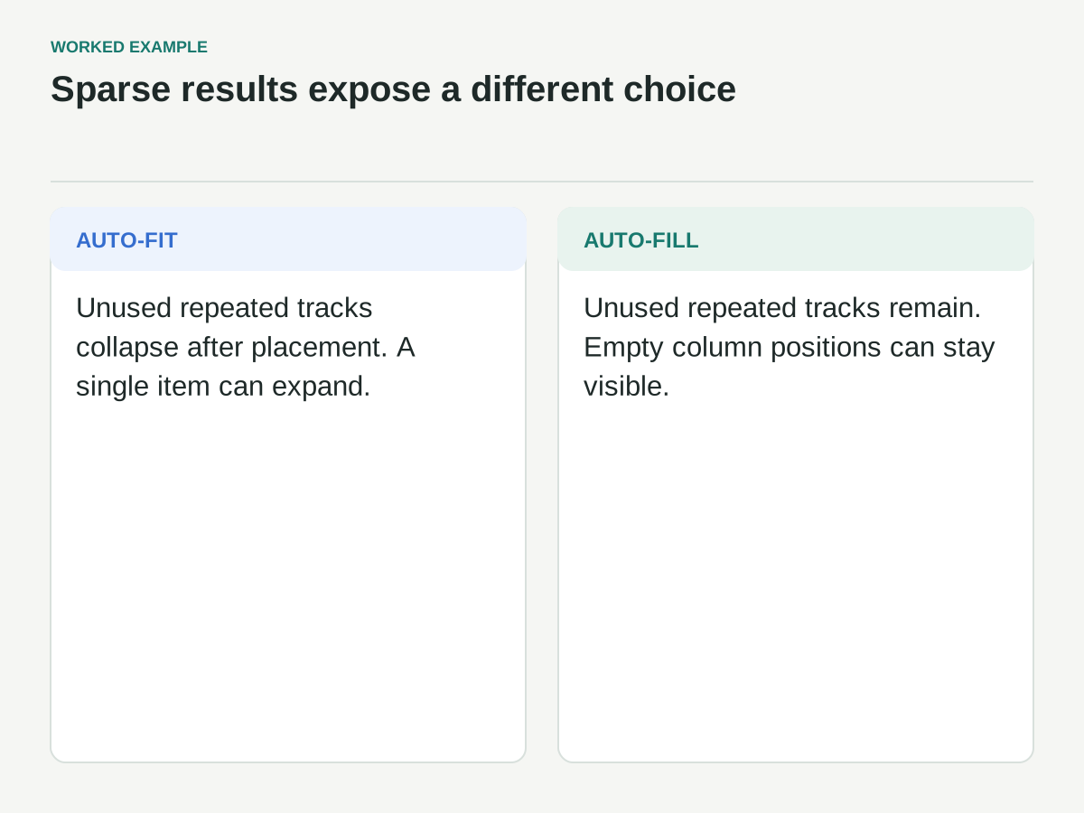
The distinction between auto-fit and auto-fill matters for sparse results. As MDN's repeat reference explains, auto-fit collapses empty repeated tracks after placement, whereas auto-fill retains them. Choose based on whether a small result set should expand into the available width or preserve empty column positions.
Turn the thresholds into test cases
The table assumes a 16px root, 18rem preferred card minimum, 1.5rem gap, enough cards to occupy the tracks, and usable grid content width excluding outer page padding. These are predictions to verify in the browser.
| Usable grid width | Predicted columns | Reason |
|---|---|---|
| 320px | 1 | The container is below the 600px two-column threshold |
| 599px | 1 | Two 288px tracks plus 24px do not fit |
| 600px | 2 | 2 × 288 + 24 = 600 |
| 911px | 2 | Three minimum tracks and two gaps do not fit |
| 912px | 3 | 3 × 288 + 2 × 24 = 912 |
Empty tracks can collapse with auto-fit, so a single item can still grow wider. An incomplete final row does not by itself make its cards expand: tracks used by items in earlier rows are not empty.
Here is the core CSS with a three-column maximum for this example. This supports the calculations; it is not a complete accessible card component or a claim of browser testing.
.template-grid {
  display: grid;
  gap: 1.5rem;
  grid-template-columns: repeat(auto-fit, minmax(min(100%, 18rem), 1fr));
  max-inline-size: 57rem;
}
.template-card {
  box-sizing: border-box;
  min-inline-size: 0;
  padding: 1.25rem;
}
.template-card__filename {
  overflow-wrap: anywhere;
}
The 57rem maximum equals three 18rem tracks and two 1.5rem gaps. With no card border, 1.25rem padding leaves 248px of content inside a 288px card at this root size. Borders would reduce that content space unless included in the calculation. Keep the grid inside its real parent and retest if the root size, padding, gap, or font changes.
Decide how one or two cards should behave
A grid with twelve cards may look excellent while one card stretches into a banner. Test sparse counts before calling the layout finished.
For the workshop library, there are two reasonable directions. You can allow a single card to grow because the preview and description benefit from more room. Or you can cap the card width and keep it aligned with the start of the grid because a very wide template thumbnail becomes visually dominant.
Neither choice is automatically better. The decision should match how the library is used. A search result often benefits from stable, familiar card dimensions. A small curated recommendation section may intentionally let a single item become more prominent.
Do not insert empty placeholder cards merely to make the last row look complete. Blank fake content adds visual noise and can complicate semantics. Let the last row be incomplete, or use an intentional layout rule that handles the real item count.
Give images their own constraints
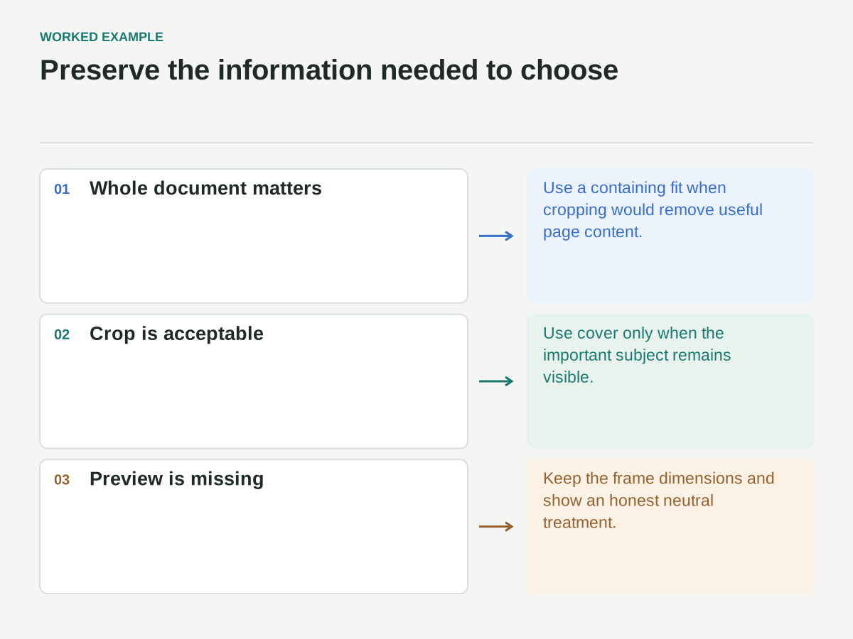
A preview should have a predictable frame so the grid does not jump between unrelated image heights. Choose an aspect ratio based on the material. For workshop documents, a landscape preview frame may contain a portrait page with surrounding space; forcing every page to fill the frame could crop the useful content.
The choice between contain and cover is therefore editorial as well as technical. MDN's object-fit documentation describes how replaced content such as images fits its box. Use contain when the whole document preview matters; use cover when a crop is acceptable and the focal content remains visible.
Specify a missing-image treatment that retains the same frame dimensions. A simple document-type label or neutral thumbnail can preserve the card's structure without pretending to be a preview of the actual file.
Check the image at the smallest card size. A detailed page thumbnail may be technically visible but functionally unreadable. In that case, treat it as a broad visual cue and ensure the title and description contain the information needed to choose.
Allow text to grow without breaking the card
Avoid fixed card heights that assume a title will always occupy two lines. Real titles, translations, and text resizing will eventually exceed the assumption. Let the content determine height, then align related elements within each row if that helps scanning.
A vertical flex layout inside the card can place the action after the content and push it toward the bottom when there is spare space. That can align actions across a row without truncating titles. Still test cards with long descriptions: alignment should not create huge unexplained gaps in shorter cards.
For long unbroken text, inspect the actual source of overflow. A filename, URL, or identifier may need a wrapping rule. MDN's overflow-wrap reference explains how the property can allow breaks when an otherwise unbreakable string would overflow. Apply it where that behavior makes sense rather than breaking every word indiscriminately.
If you choose truncation, decide what information may safely disappear and how the full text remains available. Hiding “large-print” or a version number can change the meaning of a template title. Visual neatness is not a sufficient reason to remove decision-critical text.
Keep the interaction structure simple
A card should not become a nest of competing click targets. If the whole card is a link, putting separate buttons or links inside it can create invalid or confusing interaction structures depending on the markup. Prefer a clear title link or primary action when the card contains several interactive elements.
For the sample library, the title opens the template's detail page and the download link has an explicit accessible name that identifies the template. A menu is omitted because there is no genuine secondary action to justify it.
Keep source order aligned with the intended reading and keyboard order. A visual rearrangement that puts the download button at the top while leaving it last in the document can make navigation harder to predict. Test the actual DOM and keyboard sequence, not just the arrangement in the design file.
Focus indicators must remain visible around card links and controls. Check that overflow clipping, image masks, and decorative containers do not cut them off.
Build a deliberate grid test set
Use counts of one, two, three, four, five, and seven cards. Those counts expose sparse layouts and incomplete rows more efficiently than repeatedly testing a perfect multiple of three.
Then combine count tests with content tests: the longest title first, a missing image in the middle, a description-free card beside a long description, and a long filename in the final row. Test the grid inside both a wide page and a narrower parent container.
Include narrow-width and zoom checks. W3C's reflow guidance provides a useful reference for checking whether content remains usable without unnecessary two-dimensional scrolling. Passing a single width check does not establish the accessibility of the whole component.
Record failures in terms of the constraint that broke. “At this container width, the action label forces overflow” leads to a useful decision. “Mobile looks bad” does not. The remedy might be a larger card minimum, a wrapping action label, or a different action layout.
Document the decisions that should survive
The final component notes should state the preferred minimum card width, gap, maximum grid width, sparse-count behavior, image fit rule, text-growth behavior, and interaction structure. Include the difficult content specimens alongside the ideal card.
When new content arrives, compare it with those constraints before adding a breakpoint. A breakpoint is a way to implement a decision, not an explanation for the decision itself.
A resilient responsive card grid emerges from the relationship between content and available space. Once that relationship is explicit, the CSS becomes easier to choose, the edge cases become easier to test, and the design remains useful outside the one viewport where it was first approved.