Brutalist Website Design: A Raw Guide for Modern Creators
By Steven Van ·
Explore brutalist website design, from its raw architectural roots to modern web principles. Learn how to build fast, honest, and impactful brutalist sites.
You are looking at another polished website right now. Soft gradients. Rounded cards. A hero section that looks like ten others you saw this week. The work is competent, but it all starts to blur together.
That fatigue is part of why brutalist website design still matters. It rejects the polished default and asks a harder question. What if the interface showed its structure instead of hiding it? What if a site felt more like exposed concrete than painted drywall?
For designers, that can be refreshing. For users, it can be useful. For some projects, it can also be a mistake.
Beyond the Template A New Rebellion in Web Design
Most websites today are built from familiar parts. A framework, a component library, a neat grid, a a comfortable color system. That consistency helps teams ship fast, but it also creates sameness.
Brutalism pushes back against that sameness. It does not try to look smooth, friendly, or premium by default. It often looks direct, even confrontational. Large text. Plain links. Hard edges. Awkward spacing that feels intentional rather than careless.
That is why people often misunderstand it. They see the roughness first and stop there. But the roughness is not the whole idea. Brutalism is often a way to strip a site down to its essentials so the structure is visible.
Think of the difference between a fully staged apartment and a raw studio with exposed brick, pipes, and concrete floors. One is designed to reassure. The other tells you exactly what the building is made of.
Brutalism works best when you want users to feel the interface, not forget it.
This style appeals to creators who are tired of sites that feel assembled from templates. It also appeals to teams rethinking what the modern web should prioritize. If you are already exploring how automation and generative tools are changing design workflows, this piece on the AI revolution in web design is a useful companion, because brutalism raises the opposite but related question. When tools make polished output easier, what happens when a designer chooses rawness on purpose?
That choice can be smart. It can also be lazy if it becomes an excuse for poor hierarchy or broken usability. The useful way to approach brutalism is not as a trend to copy, but as a design tool with a specific job.
The Origins of Brutalist Design From Concrete to Code
Brutalism did not begin on screens. It began in architecture, where buildings exposed their materials instead of disguising them. Concrete looked like concrete. Steel looked like steel. The structure was part of the visual language.
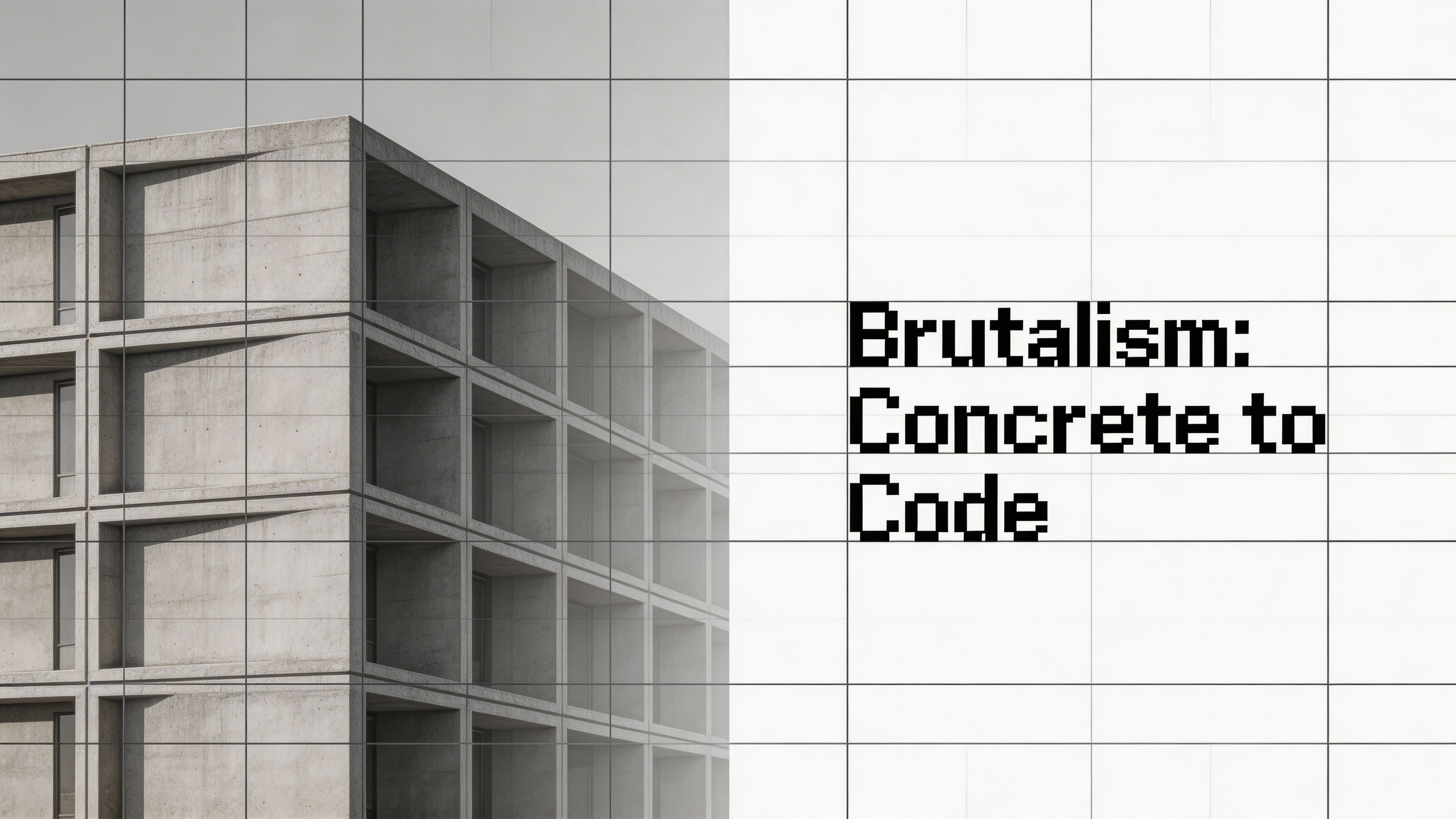
The architectural metaphor
That same attitude translates cleanly to the web. In a brutalist interface, the digital materials stay visible. HTML looks like HTML. Links look like links. Grids may be exposed rather than hidden under decoration.
In practical terms, that often means:
- Default-looking elements that do not try too hard to mimic apps or physical objects
- System fonts instead of highly art-directed typography stacks
- Minimal ornament so users notice content and structure first
- Layouts that reveal construction rather than smoothing every edge
This is why brutalism feels more honest to some designers. You can see how the page is built.
How the web adopted it
The style gained identity in the mid-2010s. In 2016, The Washington Post declared brutalist web design “the hottest trend in web design,” and the movement had already been named around 2014 by designer Pascal Deville, who launched the Brutalist Websites directory to catalog sites reacting against the lightness and optimism of mainstream web aesthetics (reference).
That timeline matters because brutalism was not random ugliness. It was a reaction. Designers were pushing back against frictionless, over-styled interfaces and rediscovering the raw feel of earlier web pages.
Architectural brutalism exposed concrete. Web brutalism exposes code decisions.
Why that philosophy still resonates
Many modern interfaces try to disappear. Brutalist websites do the opposite. They remind users they are on a constructed surface with hierarchy, choices, and constraints.
That can be powerful for editorial projects, portfolios, art spaces, experimental brands, and product pages that want a memorable voice. It can also sharpen a designer’s thinking. When you remove shadows, gradients, and animation, weak content and weak hierarchy become obvious fast.
That is one reason brutalism remains useful as a discipline, even for teams that never build a fully brutalist site.
Core Principles of Brutalist Website Design
Brutalist website design is easier to use when you stop treating it like a mood and start treating it like a set of design decisions. A few principles appear repeatedly.
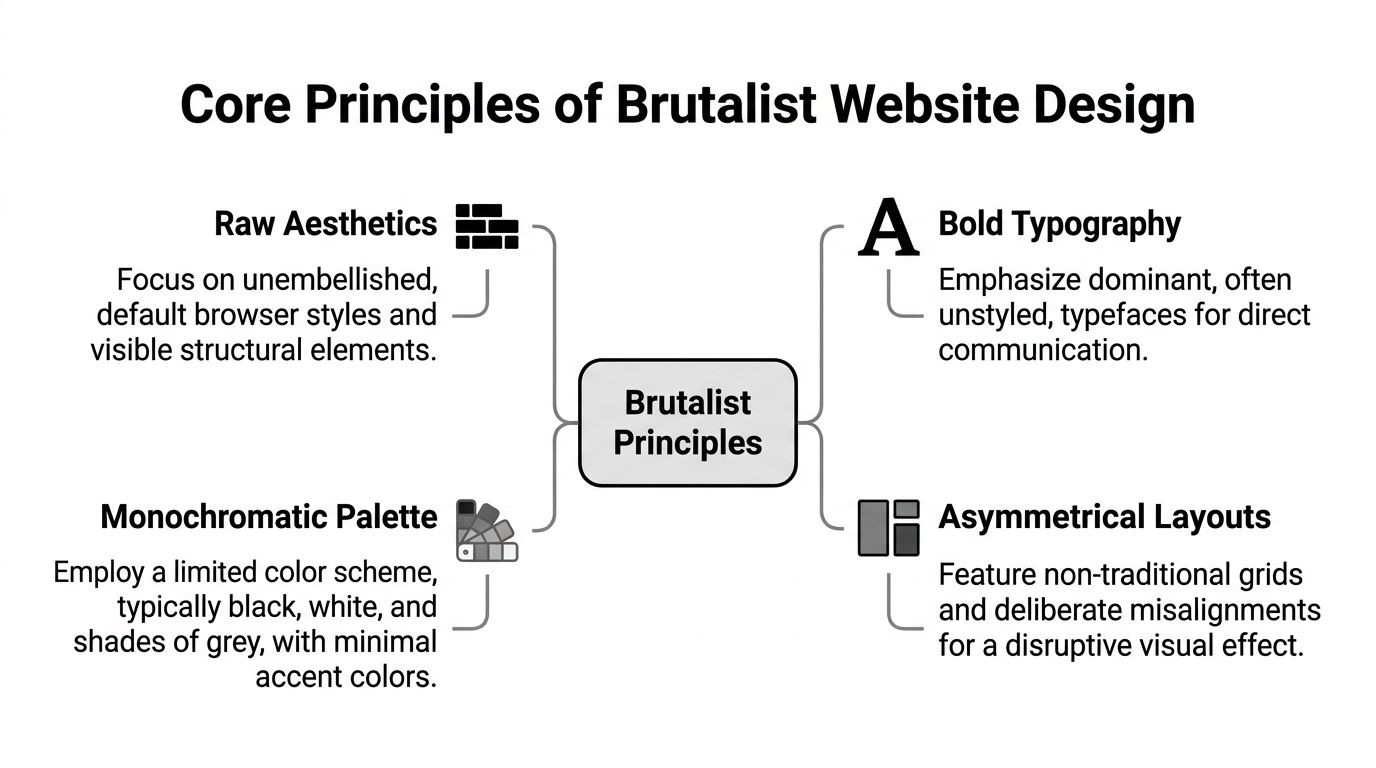
Raw aesthetics
The first principle is visible structure. Brutalist pages often keep browser-native behaviors and avoid decorative smoothing. Borders stay hard. Buttons can look like buttons. Links are obvious.
This changes the user experience in a simple way. People spend less time decoding the chrome and more time reading the page.
If a polished UI whispers, a brutalist UI speaks in a plain voice.
Typography that leads
Typography often does the heavy lifting. Instead of relying on layered visual effects, brutalist design uses size, weight, and placement to create hierarchy.
You will often see:
- Large headlines that dominate the screen
- System or web-safe fonts that feel direct
- Monospaced or utilitarian type choices when the brand can carry that tone
- Underlined links and obvious buttons that reduce ambiguity
That directness can work well. A 2023 University of Zagreb study found that users aged 18 to 30 achieved 100% success rates in first-click tests on brutalist sites and reported high satisfaction, which suggests raw functionality can still perform strongly despite rough aesthetics (reference).
Limited color and sharp contrast
Many brutalist sites lean on black, white, gray, and a small number of assertive accent colors. The palette is usually not there to charm. It is there to separate, emphasize, and signal.
That does not mean every brutalist site must be monochrome. Neo-brutalist work often adds louder color. But the spirit stays the same. Color should do a job, not soften the page.
If you are refining a brand system before pushing it toward a harsher visual language, this guide on choosing the perfect palette can help: https://creatorstoolbox.com/blog/how-to-choose-the-perfect-color-palette-for-your-brand
Layouts that refuse to disappear
Brutalist layouts are often asymmetrical, rigid, or strangely open. They may use visible grid logic, or they may deliberately challenge expected alignment. The key is that the composition should feel authored.
A quick way to tell brutalism from ordinary minimalism is this. Minimalism removes elements to create calm. Brutalism removes polish to create tension.
Here is a simple comparison:
| Trait | Minimalism | Brutalism |
|---|---|---|
| Goal | Calm and clarity | Directness and friction |
| Visual finish | Refined | Exposed |
| Navigation feel | Quiet | Explicit |
| Emotional effect | Elegant | Provocative |
Content first, not style first
The strongest brutalist sites still organize information well. That is where beginners get tripped up. They copy the rough look, then forget the underlying logic.
A useful test is simple. If you strip away every decorative choice, does the page still make sense in plain HTML? If yes, you are probably building with brutalist discipline. If no, you are probably building a costume.
Brutalism in the Wild Examples and Anti-Examples
Theory gets clearer when you compare real patterns. Brutalism is not one look. It is a family of decisions that show up differently depending on the project.
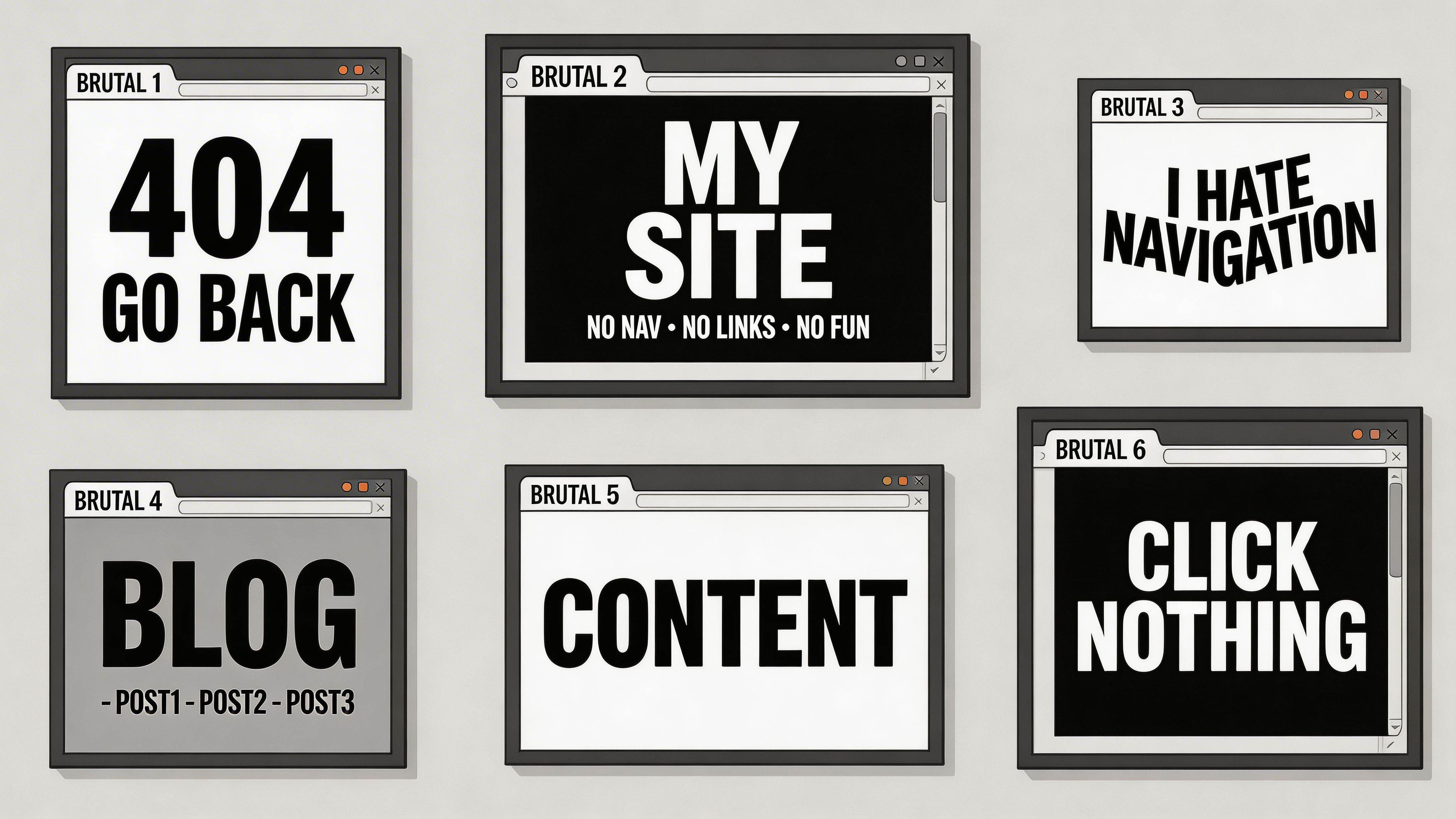
What counts as brutalist
Some well-known digital products borrow brutalist traits without going fully anti-design.
Bloomberg is a good example of a content-first interface with a hard-edged, information-dense feel. It does not look accidental. It looks urgent.
Older Reddit interfaces also fit the conversation. The appeal was never visual luxury. It was speed, structure, and content access.
An artist portfolio can push the style further. Oversized type, exposed image containers, clashing modules, and abrupt navigation can all work if the portfolio itself is making a statement about the creator.
For inspiration on how strong portfolio personalities show up in practice, these web design portfolio examples are useful to review through a brutalist lens.
What is only adjacent
A lot of people confuse minimalism, neo-brutalism, and full brutalism.
Minimalist sites are usually calm, spacious, and carefully refined. They remove clutter to make the experience feel effortless. Apple is the classic anti-example here. Its pages are sparse, but not brutalist. Every detail aims for polish.
Neo-brutalism often keeps the thick borders, flat surfaces, and bold type, but adds more system and friendliness. It is more likely to use bright colors, card-based layouts, and playful shapes. It feels sharper than standard SaaS design, but less confrontational than old-school brutalism.
A useful comparison
| Site style | What you notice first | What it tries to do |
|---|---|---|
| Minimalist | Space and restraint | Remove distraction |
| Neo-brutalist | Bold shapes and high contrast | Stand out while staying structured |
| Brutalist | Raw hierarchy and exposed construction | Make the interface itself part of the message |
The difference is often emotional. Minimalism says, “Relax, we handled it.” Brutalism says, “This is the page. Use it.”
A visual walkthrough helps here:
Anti-examples sharpen your eye
If a site is neat, evenly spaced, highly polished, and intentionally invisible, it is probably not brutalist.
If a site feels raw but still has clear structure, obvious interactions, and a strong typographic hierarchy, you may be looking at brutalism done well.
The distinction matters because copying the surface traits without understanding the intent leads to the worst version of the style. It becomes noise, not design.
How to Build a Brutalist Website A Practical Guide
Building a brutalist site is less about adding special effects and more about refusing them. That sounds simple. It is not. The discipline is in knowing what to leave alone.
Start with HTML before styling
Write the page in semantic HTML first. Headings, paragraphs, lists, links, forms, and buttons. Do not jump into decorative layout work.
A brutalist page should survive this early stage well. If the content feels weak without styling, solve the content structure before you solve the visuals.
Good candidates for this workflow include static site generators and low-dependency builds. If you prefer a visual builder with enough control to keep things simple, Webflow can work when you intentionally resist over-designing components: https://creatorstoolbox.com/tools/webflow
The best brutalist builds often feel like plain HTML that was edited carefully, not decorated heavily.
Shape the layout with restraint
A brutalist layout can be single-column, split-column, or grid-based. The key is clarity, not flourish.
Try one of these patterns:
Single-column editorial flow Strong for essays, manifestos, and portfolios. Let typography carry the hierarchy.
Exposed grid Use CSS Grid, but do not hide the bones. Hard gaps, visible borders, and obvious module boundaries help.
Intentional asymmetry Break alignment only when it creates emphasis. Random imbalance looks sloppy fast.
A common mistake is making every section weird. Keep some parts stable so the disruptive moments have contrast.
Choose type like a builder chooses materials
System fonts fit brutalism well because they feel native to the machine. They also reduce dependencies.
Useful directions include:
- Sans-serif system stacks for blunt clarity
- Monospace accents for captions, labels, or code-heavy brands
- Heavy headline weights when the page needs authority
- Underlines and outlines instead of subtle hover effects
Avoid decorative type unless it serves the concept. Brutalism usually gains strength from restraint, not novelty.
Keep media direct
Images do not need heavy art direction to work in a brutalist layout. In fact, overly processed imagery can weaken the effect.
Use:
- Uncropped or plainly cropped images when authenticity matters
- Visible image borders
- Simple captions
- Raw scans, screenshots, or documentary-style visuals when the subject supports it
Do not make every asset rough on purpose. One clean image inside a harsh layout can create stronger tension than a page full of distressed effects.
Let performance become part of the design
Here, brutalism becomes more than a visual stance. It can also be a performance strategy.
Brutalist sites can load in under 1 second on 3G networks because minimal CSS and unstyled HTML reduce file sizes by up to 80 to 90 percent, with LCP under 1 second compared with an industry average of 2.5 seconds according to Magnatechnology (reference).
That practical benefit changes how you build. You do not need a massive design system to make the page feel intentional.
A simple build checklist:
- Trim CSS aggressively and challenge every utility class
- Skip animation by default unless it helps orientation
- Use native form elements before replacing them
- Test in Lighthouse and on a slow mobile connection
- Audit font loading and remove anything non-essential
Tools and habits that help
Brutalism pairs well with small, understandable tools.
Consider this stack:
| Need | Practical option |
|---|---|
| Fast prototype | Plain HTML and CSS |
| Static publishing | Eleventy, Hugo, or Jekyll |
| Visual build | Webflow with restrained styling |
| Performance check | Lighthouse |
| Accessibility review | Keyboard testing, screen readers, contrast tools |
Do not confuse less code with less craft
The hard part of brutalism is not writing less CSS. The hard part is making a sparse interface feel deliberate.
That means editing aggressively. Remove anything ornamental that does not strengthen hierarchy. Keep anything that helps reading, scanning, or interaction. When in doubt, ask a blunt question. Does this visual choice help the user understand the page faster?
If the answer is no, cut it.
The Brutalist Dilemma Usability and Accessibility
Brutalist website design often gets praised for honesty. That praise can become careless if it ignores who gets excluded by the interface.
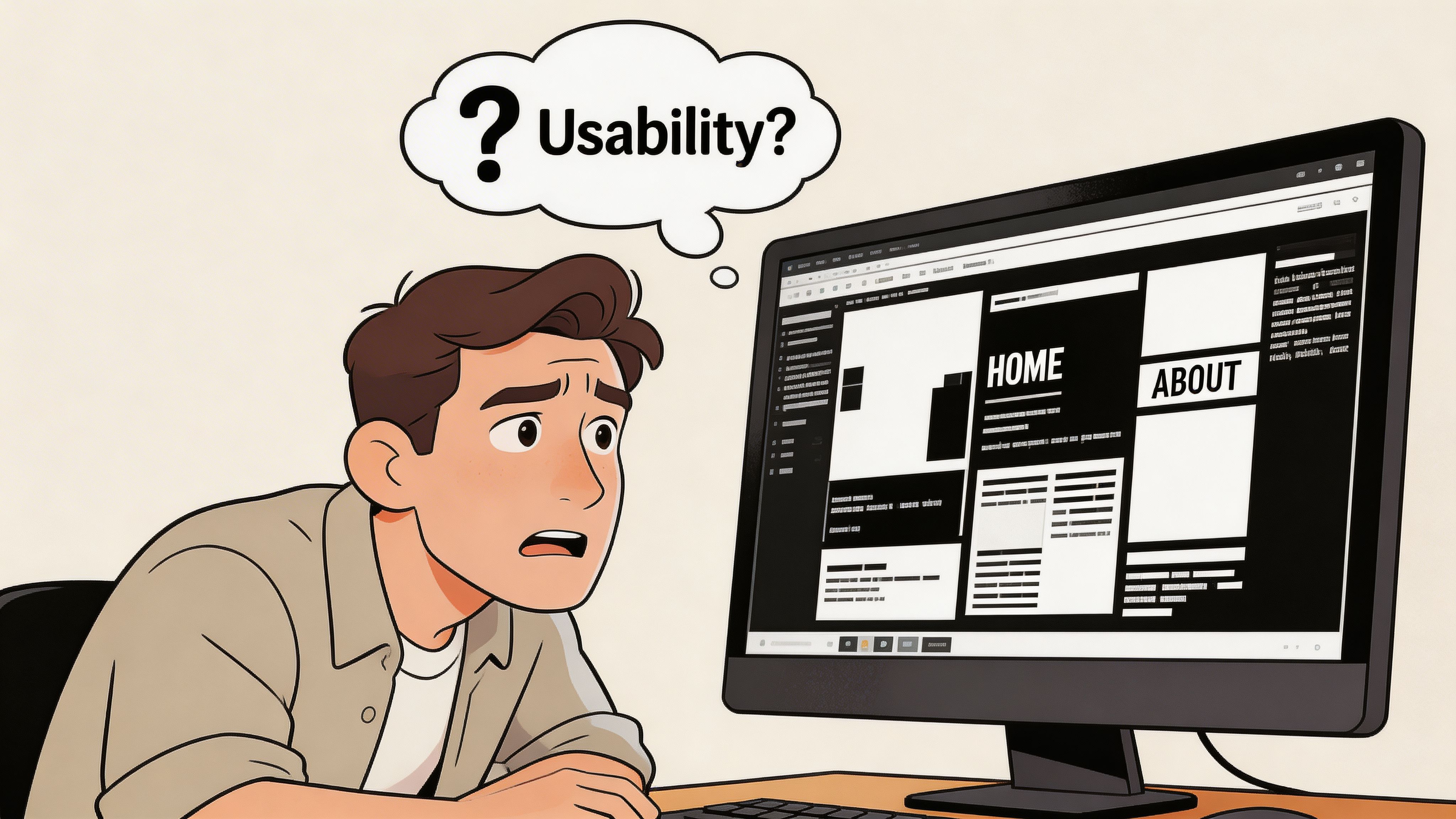
Where the style can go wrong
The risk is not rawness itself. The risk is when designers use rawness as permission to ignore basic usability.
The Nielsen Norman Group notes that brutalist antidesign elements can be “ugly, disorienting, or complex,” and may conflict with WCAG 2.1 expectations. The same discussion warns that issues such as poor contrast and inconsistent spacing can exclude the 15 to 20 percent of global users with visual impairments (reference).
That is the part many moodboards skip. A site can feel bold to a designer and still feel hostile to a user.
Common failure points
Some patterns deserve extra caution:
Chaotic hierarchy If everything shouts, nothing leads.
Low-contrast experiments Brutalism often gets associated with stark contrast, but many designers drift into unreadable combinations in the name of rebellion.
Unusual navigation Hidden logic may feel clever in a portfolio and frustrating everywhere else.
Spacing inconsistency Tight, irregular spacing can make scanning harder, especially for users who rely on predictable structure.
A brutalist site should challenge aesthetic expectations, not basic access.
How to keep the edge without breaking the experience
You can hold onto brutalist character and still build responsibly.
Try this approach:
- Keep links unmistakable.
- Test the full site with keyboard navigation.
- Use semantic HTML before custom interaction patterns.
- Check headings in screen reader order.
- Review contrast and focus states before launch.
If you need a practical benchmark while auditing, these accessibility guidelines for websites are a helpful reference point.
The better standard
The strongest brutalist work is not the most difficult work. It is the work that reduces decoration while preserving orientation, hierarchy, and control.
That is a higher bar than standard trend-following. You are not just deciding how a site looks. You are deciding which conventions you can safely break.
Is Brutalist Design Right For Your Project
Brutalism is a sharp tool. It can make a website feel memorable, fast, and unmistakably intentional. It can also create friction where your users need reassurance.
Ask a few direct questions before you choose it.
- Who is the audience? An art portfolio and a healthcare service should not make the same usability trade-offs.
- What is the main job of the site? Editorial, cultural, and experimental projects can support more tension than checkout flows or support portals.
- Can the brand carry the tone? Brutalism has attitude. If that attitude fights the message, it becomes noise.
- Will you test accessibility seriously? If not, keep the influence light.
- Do you want rawness, or just contrast and bold type? Sometimes neo-brutalist touches are enough.
Used well, brutalist website design is not anti-user. It is anti-polish for its own sake. That distinction matters.
A thoughtful creator does not adopt brutalism to look rebellious. They use it when exposed structure, direct hierarchy, and stripped-back performance make the work stronger.
Creators who want sharper design references, practical tools, and timely updates on web design, AI, and digital workflows should explore Creators Toolbox. It is a solid resource for staying current without getting lost in trend noise.